
Using Fourier Transforms to detect seasonal components
In my professional life as a data scientist, I have encountered time series multiple times. Most of my knowledge comes from my academic experience, specifically my courses in Econometrics (I have a degree in Economics), where we studied statistical properties and models of time series.
Among the models I studied was SARIMA, which acknowledges the seasonality of a time series, however, we have never studied how to intercept and recognize seasonality patterns.
Most of the time I had to find seasonal patterns I simply relied on visual inspections of data. This was until I stumbled on this YouTube video on Fourier transforms and eventually found out what a periodogram is.
In this blog post, I will explain and apply simple concepts that will turn into useful tools that every DS who’s studying time series should know.
Table of Contents
- What is a Fourier Transform?
- Fourier Transform in Python
- Periodogram
Overview
Let’s assume I have the following dataset (AEP energy consumption, CC0 license):
import pandas as pd
import matplotlib.pyplot as plt

df = pd.read_csv("data/AEP_hourly.csv", index_col=0)
df.index = pd.to_datetime(df.index)
df.sort_index(inplace=True)

fig, ax = plt.subplots(figsize=(20,4))
df.plot(ax=ax)
plt.tight_layout()
plt.show()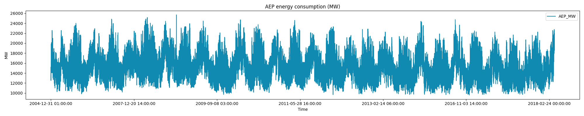
It is very clear, just from a visual inspection, that seasonal patterns are playing a role, however it might be trivial to intercept them all.
As explained before, the discovery process I used to perform was mainly manual, and it could have looked something as follows:
fig, ax = plt.subplots(3, 1, figsize=(20,9))
df_3y = df[(df.index >= '2006–01–01') & (df.index < '2010–01–01')]
df_3M = df[(df.index >= '2006–01–01') & (df.index < '2006–04–01')]
df_7d = df[(df.index >= '2006–01–01') & (df.index < '2006–01–08')]
ax[0].set_title('AEP energy consumption 3Y')
df_3y[['AEP_MW']].groupby(pd.Grouper(freq = 'D')).sum().plot(ax=ax[0])
for date in df_3y[[True if x % (24 * 365.25 / 2) == 0 else False for x in range(len(df_3y))]].index.tolist():
ax[0].axvline(date, color = 'r', alpha = 0.5)
ax[1].set_title('AEP energy consumption 3M')
df_3M[['AEP_MW']].plot(ax=ax[1])
for date in df_3M[[True if x % (24 * 7) == 0 else False for x in range(len(df_3M))]].index.tolist():
ax[1].axvline(date, color = 'r', alpha = 0.5)
ax[2].set_title('AEP energy consumption 7D')
df_7d[['AEP_MW']].plot(ax=ax[2])
for date in df_7d[[True if x % 24 == 0 else False for x in range(len(df_7d))]].index.tolist():
ax[2].axvline(date, color = 'r', alpha = 0.5)
plt.tight_layout()
plt.show()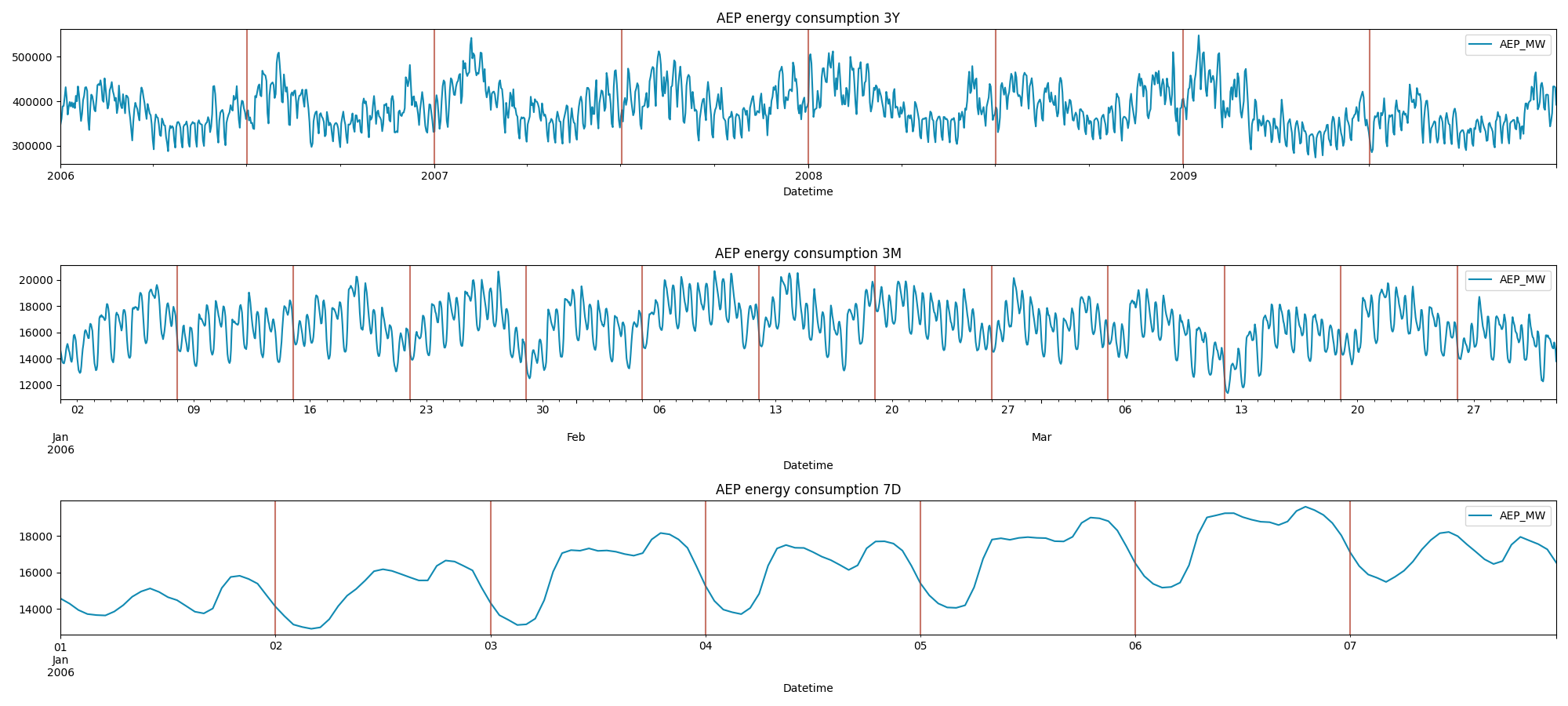
This is a more in-depth visualization of this time series. As we can see the following patterns are influencing the data:
**- a 6 month cycle,
- a weekly cycle,
- and a daily cycle.**
This dataset shows energy consumption, so these seasonal patterns are easily inferable just from domain knowledge. However, by relying only on a manual inspection we could miss important informations. These could be some of the main drawbacks:
- Subjectivity: We might miss less obvious patterns.
- Time-consuming : We need to test different timeframes one by one.
- Scalability issues: Works well for a few datasets, but inefficient for large-scale analysis.
As a Data Scientist it would be useful to have a tool that gives us immediate feedback on the most important frequencies that compose the time series. This is where the Fourier Transforms come to help.
1. What is a Fourier Transform
The Fourier Transform is a mathematical tool that allows us to “switch domain”.
Usually, we visualize our data in the time domain. However, using a Fourier Transform, we can switch to the frequency domain, which shows the frequencies that are present in the signal and their relative contribution to the original time series.
Intuition
Any well-behaved function f(x) can be written as a sum of sinusoids with different frequencies, amplitudes and phases. In simple terms, every signal (time series) is just a combination of simple waveforms.

Where:
- F(f) represents the function in the frequency domain.
- f(x) is the original function in the time domain.
- exp(−i2πf(x)) is a complex exponential that acts as a “frequency filter”.
Thus, F(f) tells us how much frequency f is present in the original function.
Example
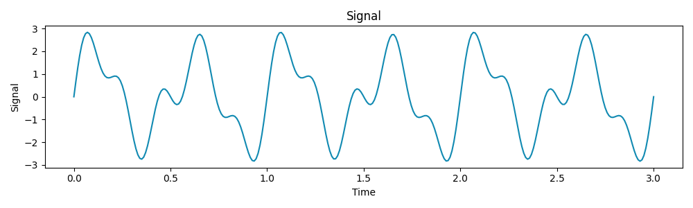
Let’s consider a signal composed of three sine waves with frequencies 2 Hz, 3 Hz, and 5 Hz:
Now, let’s apply a Fourier Transform to extract these frequencies from the signal:
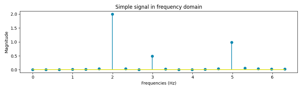
The graph above represents our signal expressed in the frequency domain instead of the classic time domain. From the resulting plot, we can see that our signal is decomposed in 3 elements of frequency 2 Hz, 3 Hz and 5 Hz as expected from the starting signal.
As said before, any well-behaved function can be written as a sum of sinusoids. With the information we have so far it is possible to decompose our signal into three sinusoids:
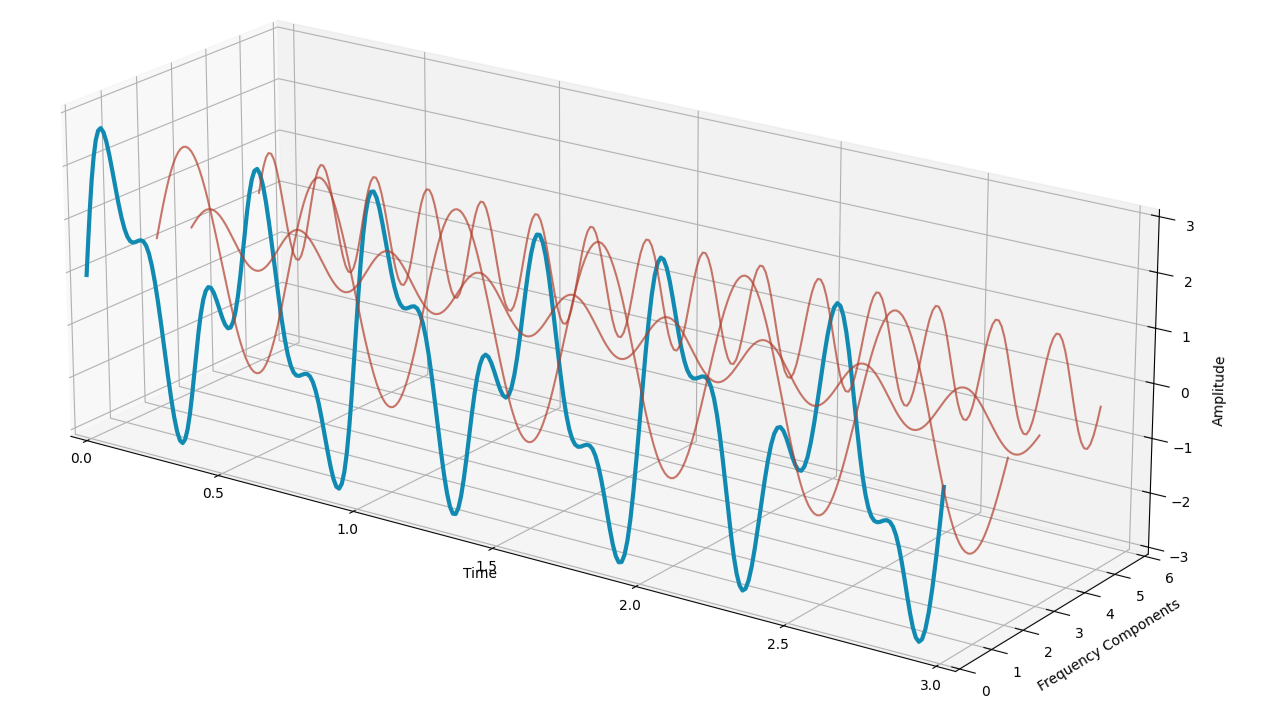
The original signal (in blue) can be obtained by summing the three waves (in red). This process can easily be applied in any time series to evaluate the main frequencies that compose the time series.
2 Fourier Transform in Python
Given that it is quite easy to switch between the time domain and the frequency domain, let’s have a look at the AEP energy consumption time series we started studying at the beginning of the article.
Python provides the “numpy.fft” library to compute the Fourier Transform for discrete signals. FFT stands for Fast Fourier Transform which is an algorithm used to decompose a discrete signal into its frequency components:
from numpy import fft

X = fft.fft(df['AEP_MW'])
N = len(X)
frequencies = fft.fftfreq(N, 1)
periods = 1 / frequencies
fft_magnitude = np.abs(X) / N

mask = frequencies >= 0

# Plot the Fourier Transform
fig, ax = plt.subplots(figsize=(20, 3))
ax.step(periods[mask], fft_magnitude[mask]) # Only plot positive frequencies
ax.set_xscale('log')
ax.xaxis.set_major_formatter('{x:,.0f}')
ax.set_title('AEP energy consumption - Frequency-Domain')
ax.set_xlabel('Frequency (Hz)')
ax.set_ylabel('Magnitude')
plt.show()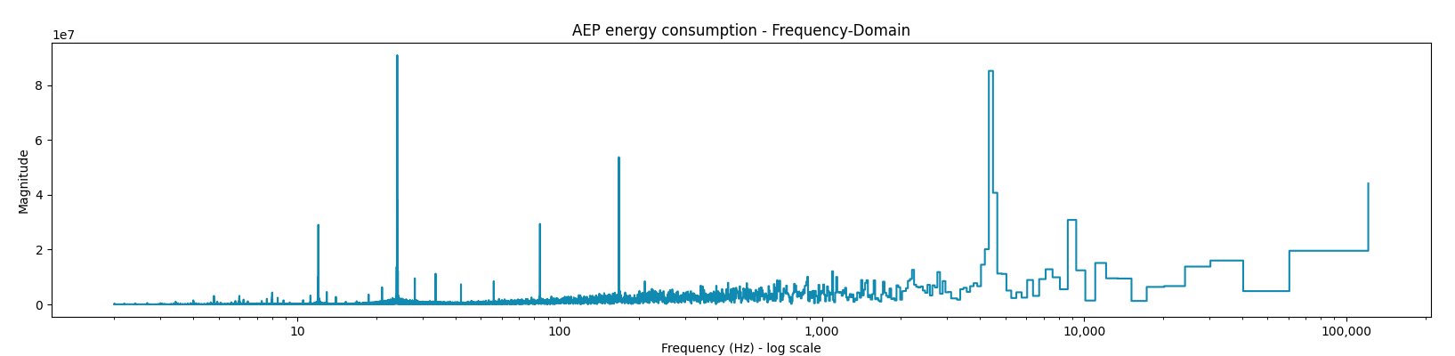
This is the frequency domain visualization of the AEP_MW energy consumption. When we analyze the graph we can already see that at certain frequencies we have a higher magnitude, implying higher importance of such frequencies.
However, before doing so we add one more piece of theory that will allow us to build a periodogram, that will give us a better view of the most important frequencies.
3. Periodogram
The periodogram is a frequency-domain representation of the power spectral density (PSD) of a signal. While the Fourier Transform tells us which frequencies are present in a signal, the periodogram quantifies the power (or intensity) of those frequencies. This passage is usefull as it reduces the noise of less important frequencies.
Mathematically, the periodogram is given by:

Where:
- P(f) is the power spectral density (PSD) at frequency f,
- X(f) is the Fourier Transform of the signal,
- N is the total number of samples.
This can be achieved in Python as follows:
power_spectrum = np.abs(X)**2 / N # Power at each frequency

fig, ax = plt.subplots(figsize=(20, 3))
ax.step(periods[mask], power_spectrum[mask])
ax.set_title('AEP energy consumption Periodogram')
ax.set_xscale('log')
ax.xaxis.set_major_formatter('{x:,.0f}')
plt.xlabel('Frequency (Hz)')
plt.ylabel('Power')
plt.show()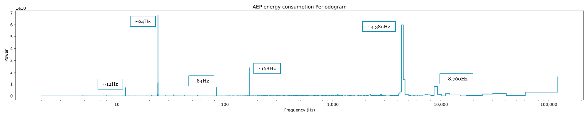
From this periodogram, it is now possible to draw conclusions. As we can see the most powerful frequencies sit at:
- 24 Hz, corresponding to 24h,
- 4.380 Hz, corresponding to 6 months,
- and at 168 Hz, corresponding to the weekly cycle.
These three are the same Seasonality components we found in the manual exercise done in the visual inspection. However, using this visualization, we can see three other cycles, weaker in power, but present:
- a 12 Hz cycle,
- an 84 Hz cycle, correspondint to half a week,
- an 8.760 Hz cycle, corresponding to a full year.
It is also possible to use the function “periodogram” present in scipy to obtain the same result.
from scipy.signal import periodogram

frequencies, power_spectrum = periodogram(df['AEP_MW'], return_onesided=False)
periods = 1 / frequencies

fig, ax = plt.subplots(figsize=(20, 3))
ax.step(periods, power_spectrum)
ax.set_title('Periodogram')
ax.set_xscale('log')
ax.xaxis.set_major_formatter('{x:,.0f}')
plt.xlabel('Frequency (Hz)')
plt.ylabel('Power')
plt.show()
Conclusions
When we are dealing with time series one of the most important components to consider is seasonalities.
In this blog post, we’ve seen how to easily discover seasonalities within a time series using a periodogram. Providing us with a simple-to-implement tool that will become extremely useful in the exploratory process.
However, this is just a starting point of the possible implementations of Fourier Transform that we could benefit from, as there are many more:
- Spectrogram
- Feature encoding
- Time series decomposition
- …
Please leave some claps if you enjoyed the article and feel free to comment, any suggestion and feedback is appreciated!
_Here you can find a notebook with the code from this blog post._
The post How to Find Seasonality Patterns in Time Series appeared first on Towards Data Science.
Using Fourier Transform to detect seasonal components
The post How to Find Seasonality Patterns in Time Series appeared first on Towards Data Science. Data Science, Programming, Fourier Transform, Seasonality, Timeseries Towards Data ScienceRead More


0 Comments