MODEL EVALUATION & OPTIMIZATION
When all models have similar accuracy, now what?
You’ve trained several classification models, and they all seem to be performing well with high accuracy scores. Congratulations!
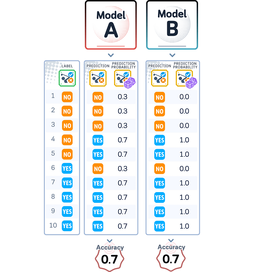
But hold on — is one model truly better than the others? Accuracy alone doesn’t tell the whole story. What if one model consistently overestimates its confidence, while another underestimates it? This is where model calibration comes in.
Here, we’ll see what model calibration is and explore how to assess the reliability of your models’ predictions — using visuals and practical code examples to show you how to identify calibration issues. Get ready to go beyond accuracy and light up the true potential of your machine learning models!

Understanding Calibration
Model calibration measures how well a model’s prediction probabilities match its actual performance. A model that gives a 70% probability score should be correct 70% of the time for similar predictions. This means its probability scores should reflect the true likelihood of its predictions being correct.
Why Calibration Matters
While accuracy tells us how often a model is correct overall, calibration tells us whether we can trust its probability scores. Two models might both have 90% accuracy, but one might give realistic probability scores while the other gives overly confident predictions. In many real applications, having reliable probability scores is just as important as having correct predictions.
Perfect Calibration vs. Reality
A perfectly calibrated model would show a direct match between its prediction probabilities and actual success rates: When it predicts with 90% probability, it should be correct 90% of the time. The same applies to all probability levels.
However, most models aren’t perfectly calibrated. They can be:
- Overconfident: giving probability scores that are too high for their actual performance
- Underconfident: giving probability scores that are too low for their actual performance
- Both: overconfident in some ranges and underconfident in others
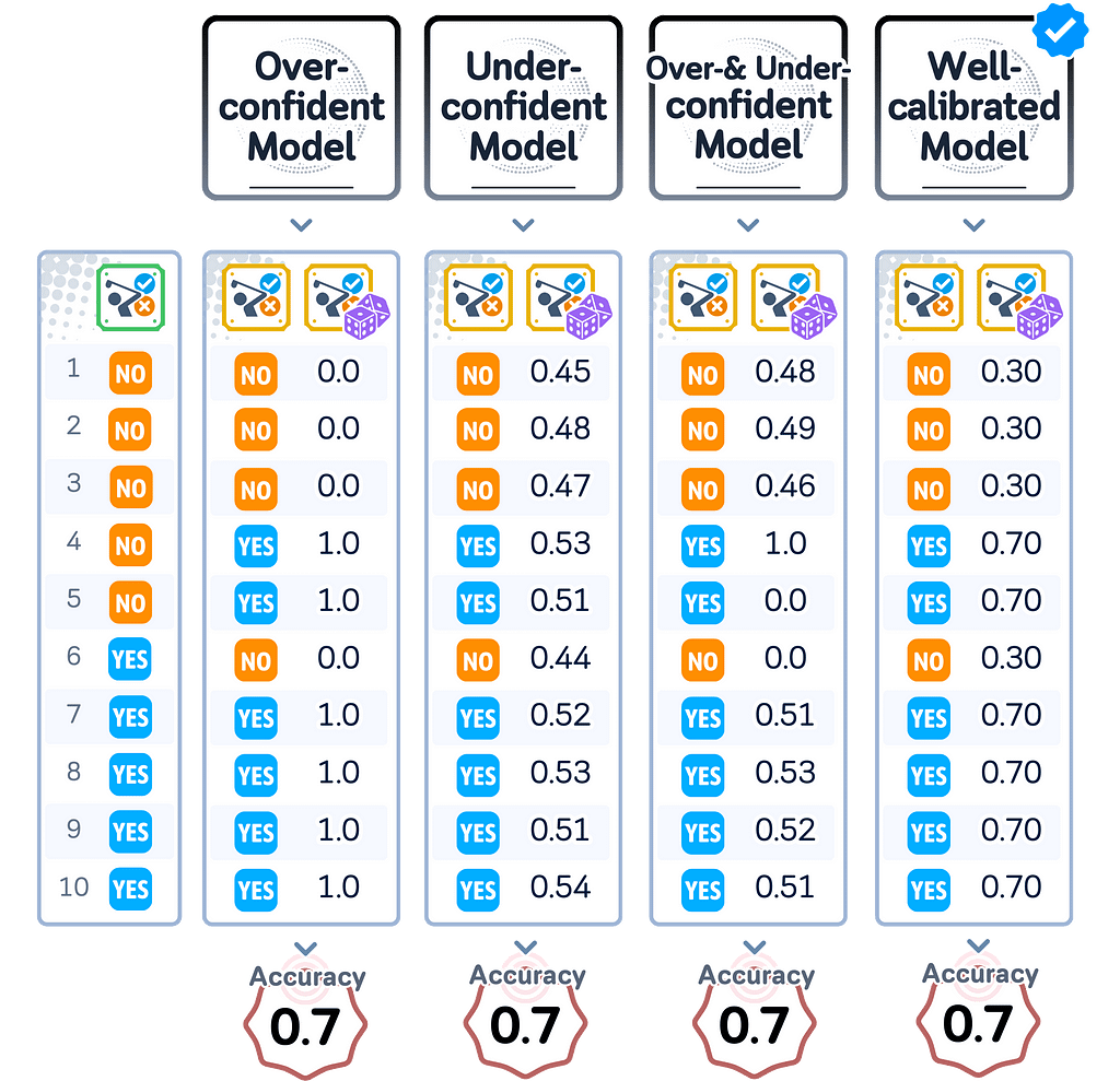
This mismatch between predicted probabilities and actual correctness can lead to poor decision-making when using these models in real applications. This is why understanding and improving model calibration is necessary for building reliable machine learning systems.
📊 Dataset Used
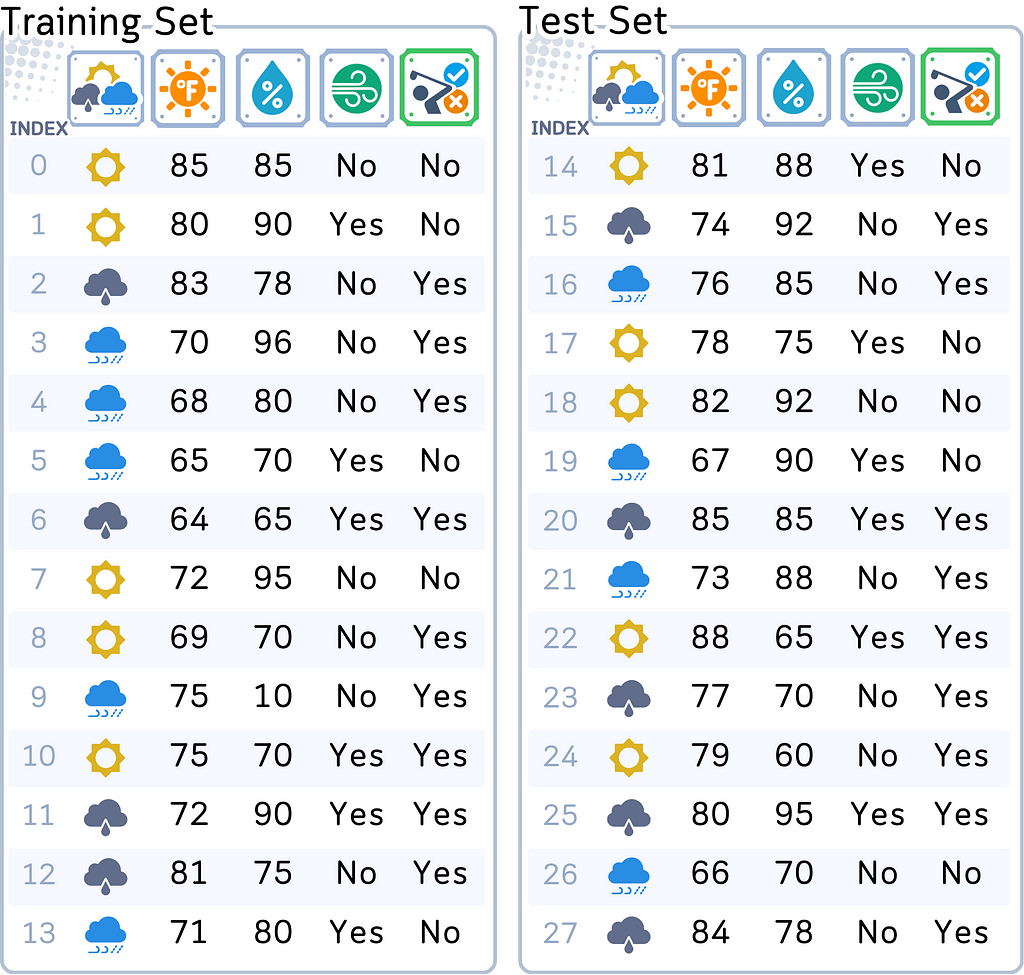
To explore model calibration, we’ll continue with the same dataset used in my previous articles on Classification Algorithms: predicting whether someone will play golf or not based on weather conditions.
import pandas as pd
import numpy as np
from sklearn.metrics import accuracy_score
from sklearn.model_selection import train_test_split

# Create and prepare dataset
dataset_dict = {
    'Outlook': ['sunny', 'sunny', 'overcast', 'rainy', 'rainy', 'rainy', 'overcast',
                'sunny', 'sunny', 'rainy', 'sunny', 'overcast', 'overcast', 'rainy',
                'sunny', 'overcast', 'rainy', 'sunny', 'sunny', 'rainy', 'overcast',
                'rainy', 'sunny', 'overcast', 'sunny', 'overcast', 'rainy', 'overcast'],
    'Temperature': [85.0, 80.0, 83.0, 70.0, 68.0, 65.0, 64.0, 72.0, 69.0, 75.0, 75.0,
                   72.0, 81.0, 71.0, 81.0, 74.0, 76.0, 78.0, 82.0, 67.0, 85.0, 73.0,
                   88.0, 77.0, 79.0, 80.0, 66.0, 84.0],
    'Humidity': [85.0, 90.0, 78.0, 96.0, 80.0, 70.0, 65.0, 95.0, 70.0, 80.0, 70.0,
                 90.0, 75.0, 80.0, 88.0, 92.0, 85.0, 75.0, 92.0, 90.0, 85.0, 88.0,
                 65.0, 70.0, 60.0, 95.0, 70.0, 78.0],
    'Wind': [False, True, False, False, False, True, True, False, False, False, True,
             True, False, True, True, False, False, True, False, True, True, False,
             True, False, False, True, False, False],
    'Play': ['No', 'No', 'Yes', 'Yes', 'Yes', 'No', 'Yes', 'No', 'Yes', 'Yes', 'Yes',
             'Yes', 'Yes', 'No', 'No', 'Yes', 'Yes', 'No', 'No', 'No', 'Yes', 'Yes',
             'Yes', 'Yes', 'Yes', 'Yes', 'No', 'Yes']
}
# Prepare data
df = pd.DataFrame(dataset_dict)
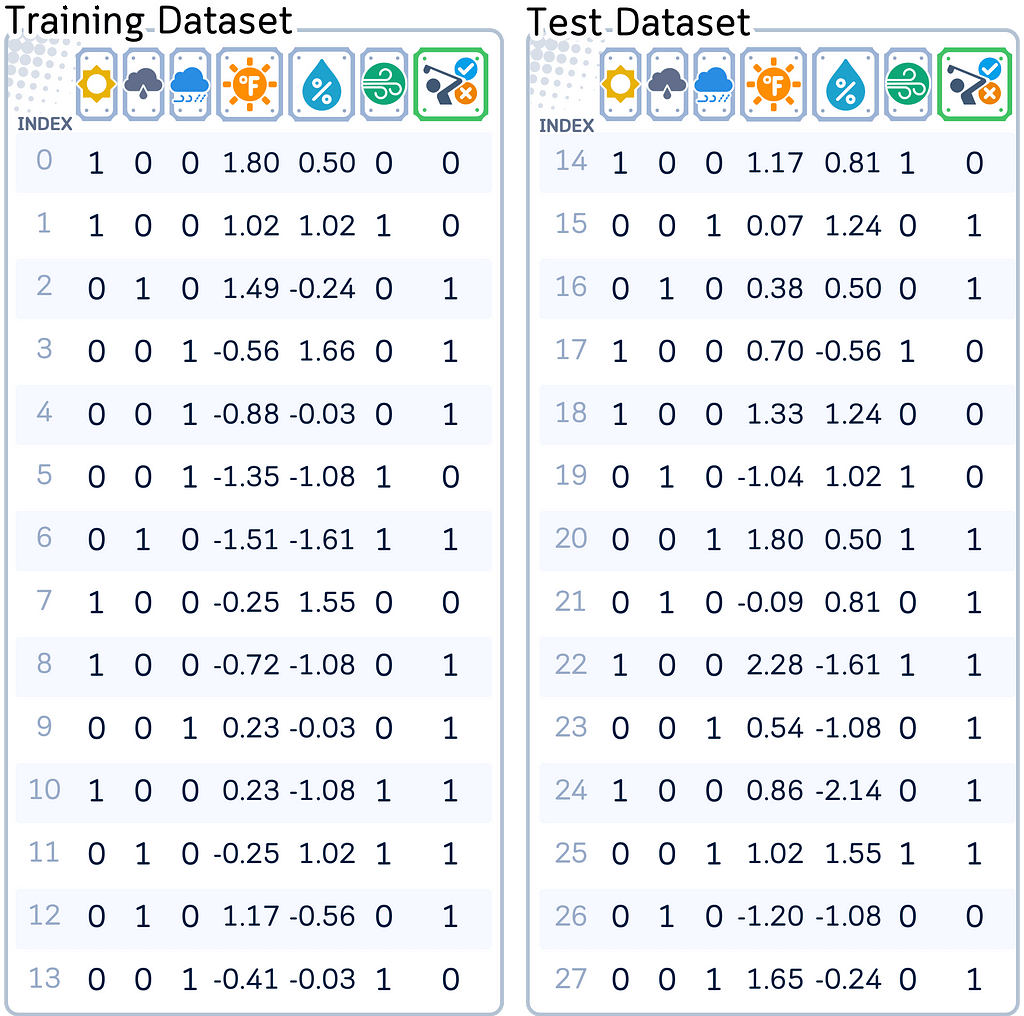
Before training our models, we normalized numerical weather measurements through standard scaling and transformed categorical features with one-hot encoding. These preprocessing steps ensure all models can effectively use the data while maintaining fair comparisons between them.
from sklearn.preprocessing import StandardScaler
df = pd.get_dummies(df, columns=['Outlook'], prefix='', prefix_sep='', dtype=int)
df['Wind'] = df['Wind'].astype(int)
df['Play'] = (df['Play'] == 'Yes').astype(int)

# Rearrange columns
column_order = ['sunny', 'overcast', 'rainy', 'Temperature', 'Humidity', 'Wind', 'Play']
df = df[column_order]

# Prepare features and target
X,y = df.drop('Play', axis=1), df['Play']
X_train, X_test, y_train, y_test = train_test_split(X, y, train_size=0.5, shuffle=False)

# Scale numerical features
scaler = StandardScaler()
X_train[['Temperature', 'Humidity']] = scaler.fit_transform(X_train[['Temperature', 'Humidity']])
X_test[['Temperature', 'Humidity']] = scaler.transform(X_test[['Temperature', 'Humidity']])
Models and Training
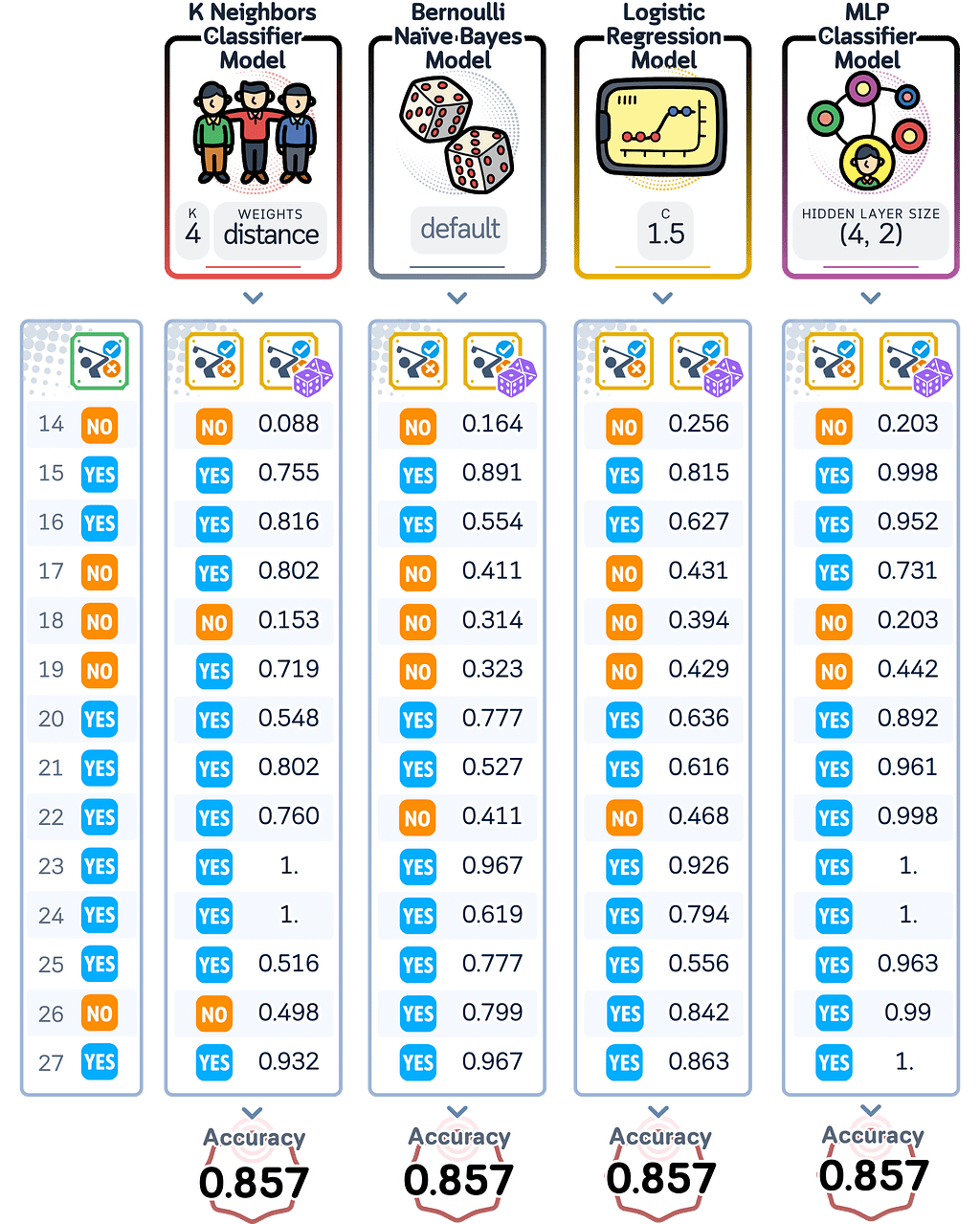
For this exploration, we trained four classification models to similar accuracy scores:
- K-Nearest Neighbors (kNN)
- Bernoulli Naive Bayes
- Logistic Regression
- Multi-Layer Perceptron (MLP)
For those who are curious with how those algorithms make prediction and their probability, you can refer to this article:
Predicted Probability, Explained: A Visual Guide with Code Examples for Beginners
While these models achieved the same accuracy in this simple problem, they calculate their prediction probabilities differently.
import numpy as np
from sklearn.neighbors import KNeighborsClassifier
from sklearn.tree import DecisionTreeClassifier
from sklearn.linear_model import LogisticRegression
from sklearn.neural_network import MLPClassifier
from sklearn.metrics import accuracy_score
from sklearn.naive_bayes import BernoulliNB

# Initialize the models with the found parameters
knn = KNeighborsClassifier(n_neighbors=4, weights='distance')
bnb = BernoulliNB()
lr = LogisticRegression(C=1, random_state=42)
mlp = MLPClassifier(hidden_layer_sizes=(4, 2),random_state=42, max_iter=2000)

# Train all models
models = {
    'KNN': knn,
    'BNB': bnb,
    'LR': lr,
    'MLP': mlp
}

for name, model in models.items():
    model.fit(X_train, y_train)

# Create predictions and probabilities for each model
results_dict = {
    'True Labels': y_test
}

for name, model in models.items():
#    results_dict[f'{name} Pred'] = model.predict(X_test)
    results_dict[f'{name} Prob'] = model.predict_proba(X_test)[:, 1]

# Create results dataframe
results_df = pd.DataFrame(results_dict)

# Print predictions and probabilities
print("nPredictions and Probabilities:")
print(results_df)

# Print accuracies
print("nAccuracies:")
for name, model in models.items():
    accuracy = accuracy_score(y_test, model.predict(X_test))
    print(f"{name}: {accuracy:.3f}")
Through these differences, we’ll explore why we need to look beyond accuracy.
Measuring Calibration
To assess how well a model’s prediction probabilities match its actual performance, we use several methods and metrics. These measurements help us understand whether our model’s confidence levels are reliable.
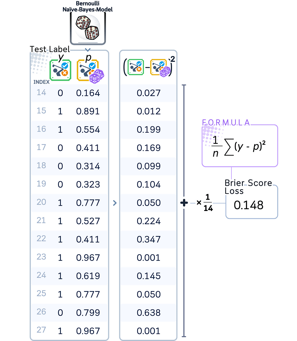
Brier Score
The Brier Score measures the mean squared difference between predicted probabilities and actual outcomes. It ranges from 0 to 1, where lower scores indicate better calibration. This score is particularly useful because it considers both calibration and accuracy together.
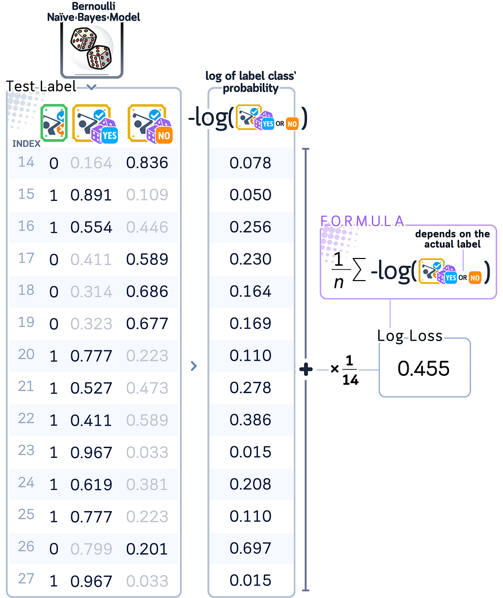
Log Loss
Log Loss calculates the negative log probability of correct predictions. This metric is especially sensitive to confident but wrong predictions — when a model says it’s 90% sure but is wrong, it receives a much larger penalty than when it’s 60% sure and wrong. Lower values indicate better calibration.
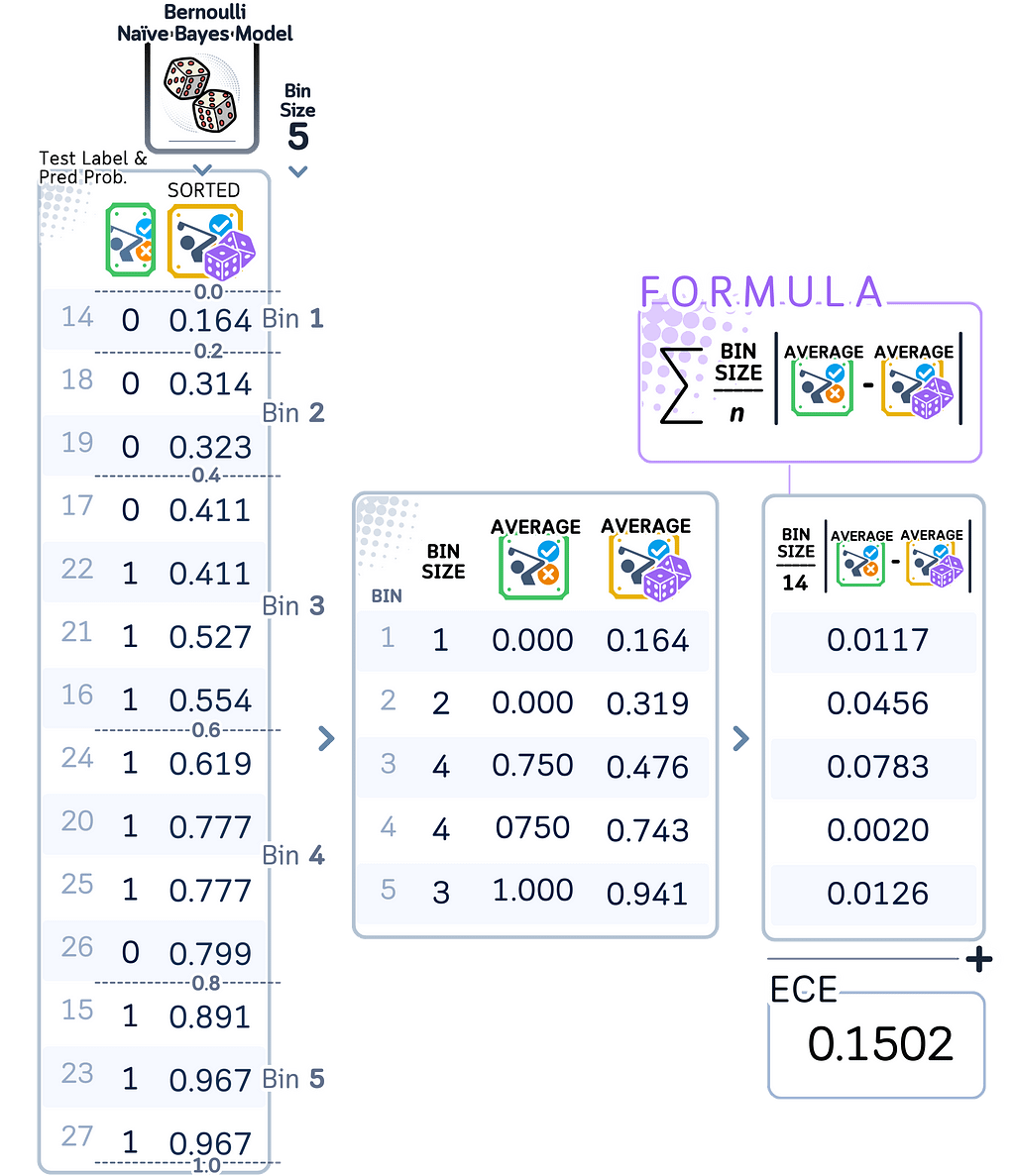
Expected Calibration Error (ECE)
ECE measures the average difference between predicted and actual probabilities (taken as average of the label), weighted by how many predictions fall into each probability group. This metric helps us understand if our model has systematic biases in its probability estimates.
Reliability Diagrams
Similar to ECE, a reliability diagram (or calibration curve) visualizes model calibration by binning predictions and comparing them to actual outcomes. While ECE gives us a single number measuring calibration error, the reliability diagram shows us the same information graphically. We use the same binning approach and calculate the actual frequency of positive outcomes in each bin. When plotted, these points show us exactly where our model’s predictions deviate from perfect calibration, which would appear as a diagonal line.
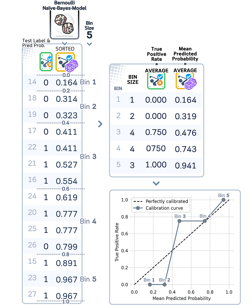
Comparing Calibration Metrics
Each of these metrics shows different aspects of calibration problems:
- A high Brier Score suggests overall poor probability estimates.
- High Log Loss points to overconfident wrong predictions.
- A high ECE indicates systematic bias in probability estimates.
Together, these metrics give us a complete picture of how well our model’s probability scores reflect its true performance.
Our Models
For our models, let’s calculate the calibration metrics and draw their calibration curves:
from sklearn.metrics import brier_score_loss, log_loss
from sklearn.calibration import calibration_curve
import matplotlib.pyplot as plt

# Initialize models
models = {
    'k-Nearest Neighbors': KNeighborsClassifier(n_neighbors=4, weights='distance'),
    'Bernoulli Naive Bayes': BernoulliNB(),
    'Logistic Regression': LogisticRegression(C=1.5, random_state=42),
    'Multilayer Perceptron': MLPClassifier(hidden_layer_sizes=(4, 2), random_state=42, max_iter=2000)
}

# Get predictions and calculate metrics
metrics_dict = {}
for name, model in models.items():
    model.fit(X_train, y_train)
    y_prob = model.predict_proba(X_test)[:, 1]
    metrics_dict[name] = {
        'Brier Score': brier_score_loss(y_test, y_prob),
        'Log Loss': log_loss(y_test, y_prob),
        'ECE': calculate_ece(y_test, y_prob),
        'Probabilities': y_prob
    }

# Plot calibration curves
fig, axes = plt.subplots(2, 2, figsize=(8, 8), dpi=300)
colors = ['orangered', 'slategrey', 'gold', 'mediumorchid']

for idx, (name, metrics) in enumerate(metrics_dict.items()):
    ax = axes.ravel()[idx]
    prob_true, prob_pred = calibration_curve(y_test, metrics['Probabilities'],
                                           n_bins=5, strategy='uniform')

    ax.plot([0, 1], [0, 1], 'k--', label='Perfectly calibrated')
    ax.plot(prob_pred, prob_true, color=colors[idx], marker='o',
            label='Calibration curve', linewidth=2, markersize=8)

    title = f'{name}nBrier: {metrics["Brier Score"]:.3f} | Log Loss: {metrics["Log Loss"]:.3f} | ECE: {metrics["ECE"]:.3f}'
    ax.set_title(title, fontsize=11, pad=10)
    ax.grid(True, alpha=0.7)
    ax.set_xlim([-0.05, 1.05])
    ax.set_ylim([-0.05, 1.05])
    ax.spines[['top', 'right', 'left', 'bottom']].set_visible(False)
    ax.legend(fontsize=10, loc='upper left')

plt.tight_layout()
plt.show()
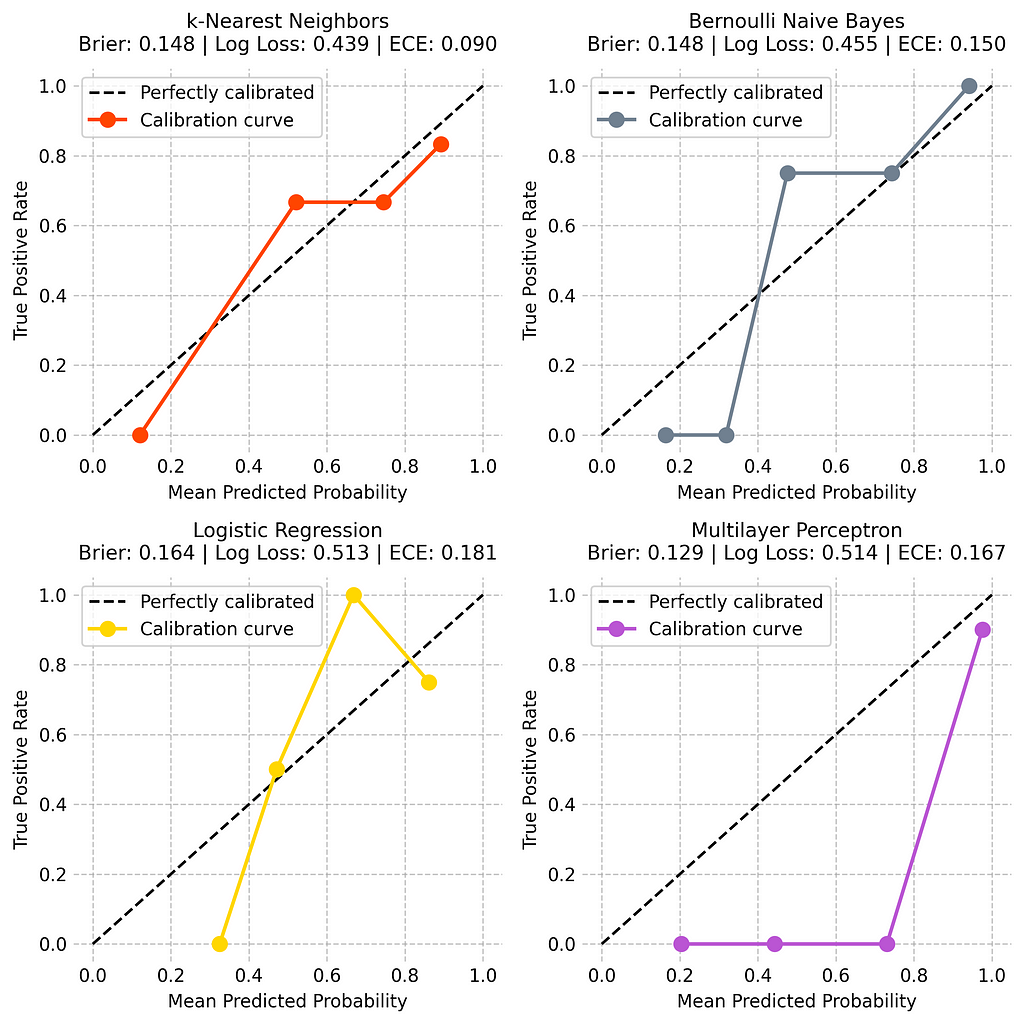
Now, let’s analyze the calibration performance of each model based on those metrics:
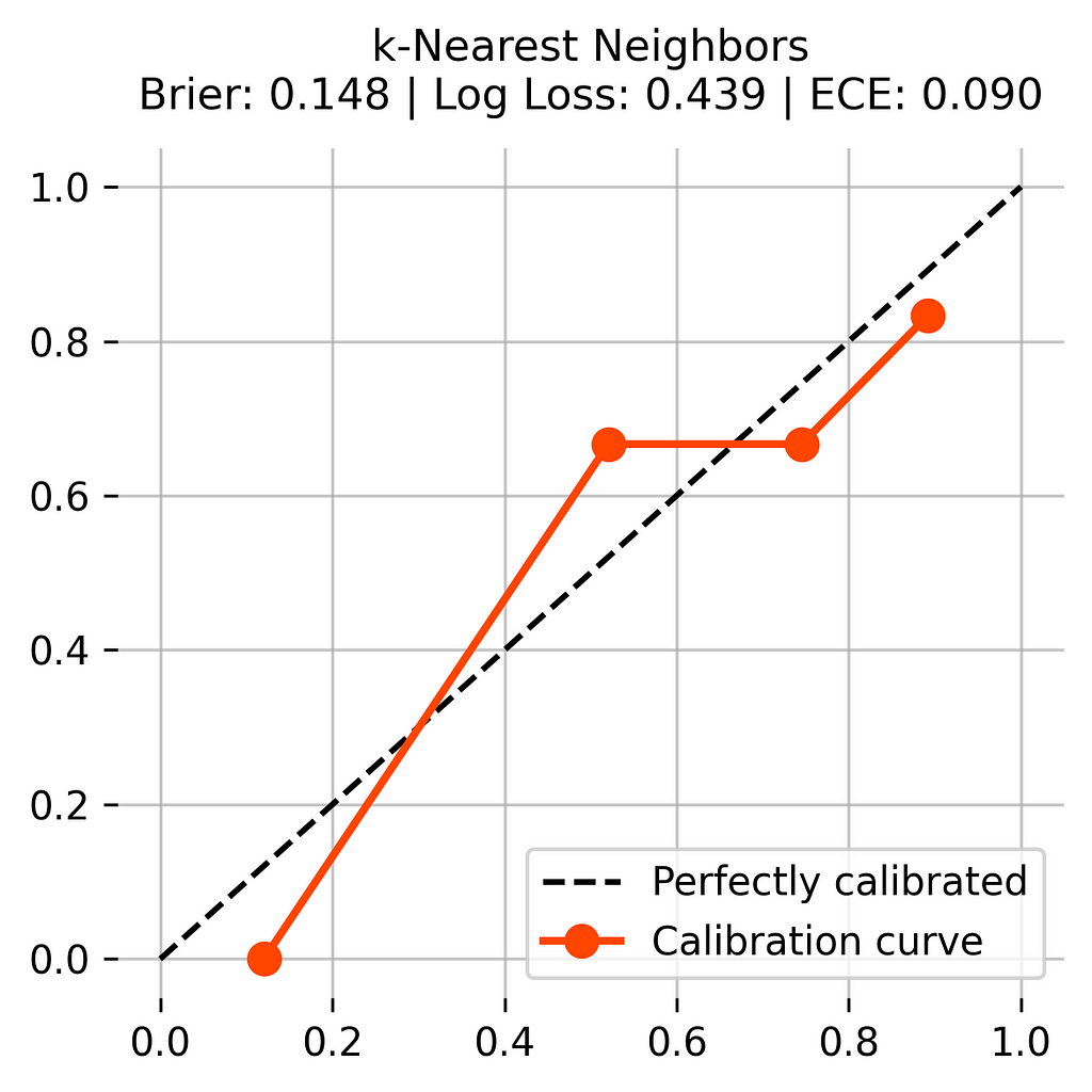
The k-Nearest Neighbors (KNN) model performs well at estimating how certain it should be about its predictions. Its graph line stays close to the dotted line, which shows good performance. It has solid scores — a Brier score of 0.148 and the best ECE score of 0.090. While it sometimes shows too much confidence in the middle range, it generally makes reliable estimates about its certainty.
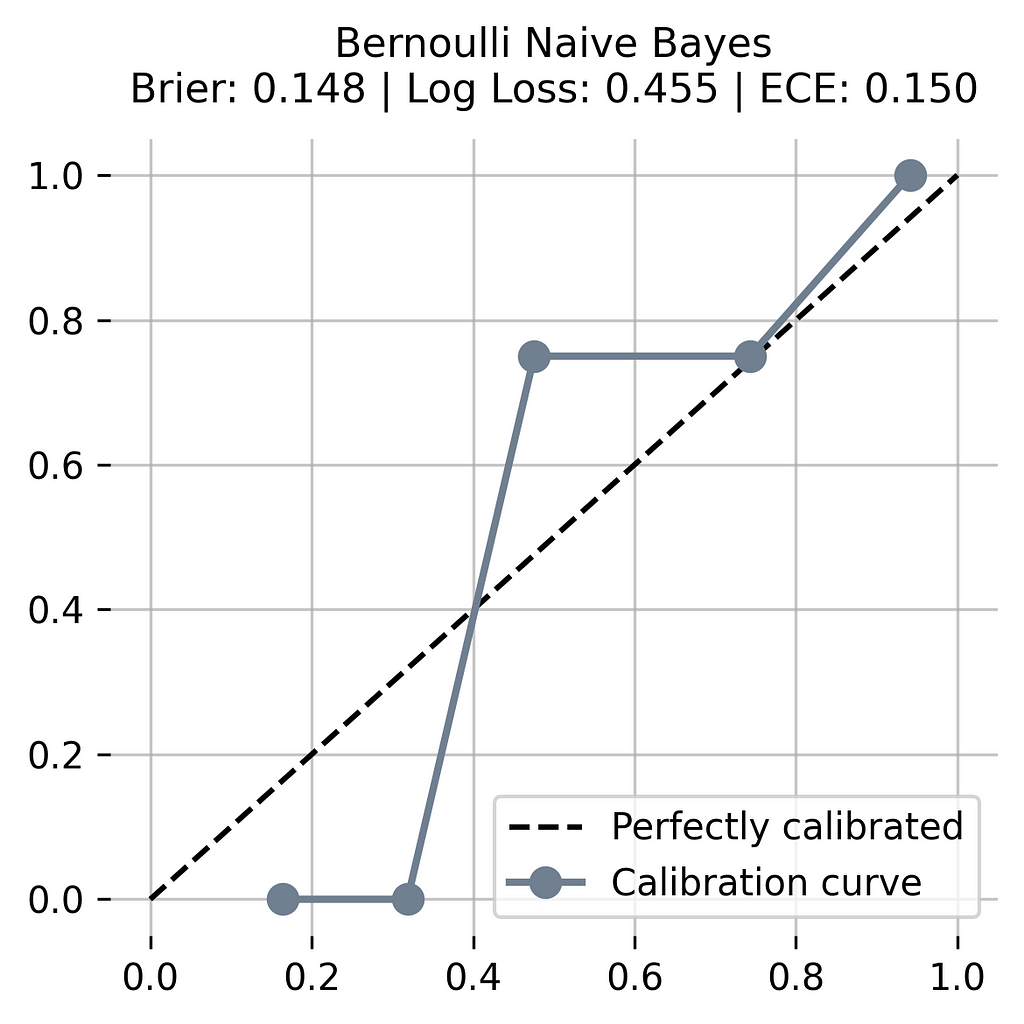
The Bernoulli Naive Bayes model shows an unusual stair-step pattern in its line. This means it jumps between different levels of certainty instead of changing smoothly. While it has the same Brier score as KNN (0.148), its higher ECE of 0.150 shows it’s less accurate at estimating its certainty. The model switches between being too confident and not confident enough.
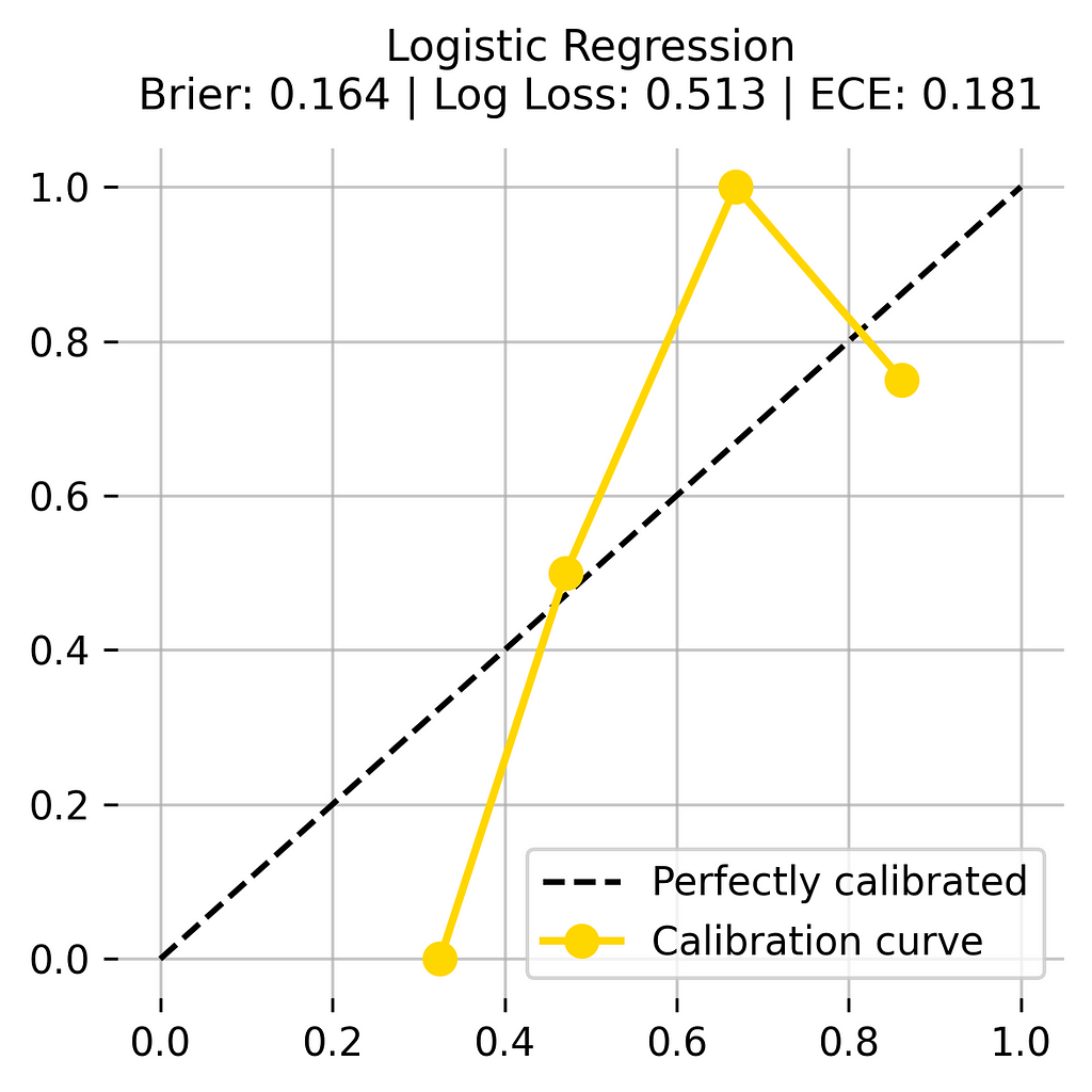
The Logistic Regression model shows clear issues with its predictions. Its line moves far away from the dotted line, meaning it often misjudges how certain it should be. It has the worst ECE score (0.181) and a poor Brier score (0.164). The model consistently shows too much confidence in its predictions, making it unreliable.
The Multilayer Perceptron shows a distinct problem. Despite having the best Brier score (0.129), its line reveals that it mostly makes extreme predictions — either very certain or very uncertain, with little in between. Its high ECE (0.167) and flat line in the middle ranges show it struggles to make balanced certainty estimates.
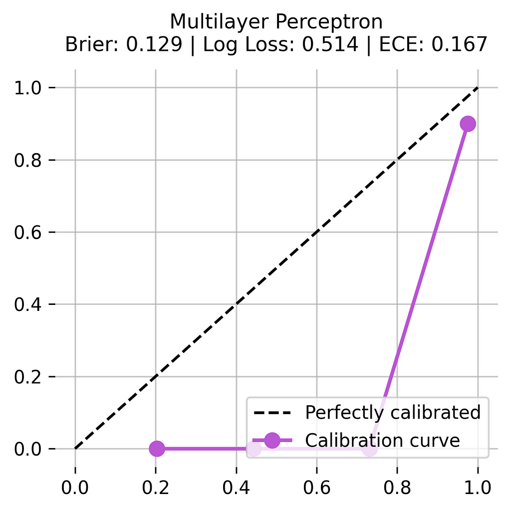
After examining all four models, the k-Nearest Neighbors clearly performs best at estimating its prediction certainty. It maintains consistent performance across different levels of certainty and shows the most reliable pattern in its predictions. While other models might score well in certain measures (like the Multilayer Perceptron’s Brier score), their graphs reveal they aren’t as reliable when we need to trust their certainty estimates.
Final Remark
When choosing between different models, we need to consider both their accuracy and calibration quality. A model with slightly lower accuracy but better calibration might be more valuable than a highly accurate model with poor probability estimates.
By understanding calibration and its importance, we can build more reliable machine learning systems that users can trust not just for their predictions, but also for their confidence in those predictions.
🌟 Model Calibration Code Summarized (1 Model)
import pandas as pd
import numpy as np
from sklearn.preprocessing import StandardScaler
from sklearn.model_selection import train_test_split
from sklearn.naive_bayes import BernoulliNB
from sklearn.metrics import brier_score_loss, log_loss
from sklearn.calibration import calibration_curve
import matplotlib.pyplot as plt

# Define ECE
def calculate_ece(y_true, y_prob, n_bins=5):
    bins = np.linspace(0, 1, n_bins + 1)
    ece = 0
    for bin_lower, bin_upper in zip(bins[:-1], bins[1:]):
        mask = (y_prob >= bin_lower) & (y_prob < bin_upper)
        if np.sum(mask) > 0:
            bin_conf = np.mean(y_prob[mask])
            bin_acc = np.mean(y_true[mask])
            ece += np.abs(bin_conf - bin_acc) * np.sum(mask)
    return ece / len(y_true)

# Create dataset and prepare data
dataset_dict = {
    'Outlook': ['sunny', 'sunny', 'overcast', 'rainy', 'rainy', 'rainy', 'overcast','sunny', 'sunny', 'rainy', 'sunny', 'overcast', 'overcast', 'rainy','sunny', 'overcast', 'rainy', 'sunny', 'sunny', 'rainy', 'overcast','rainy', 'sunny', 'overcast', 'sunny', 'overcast', 'rainy', 'overcast'],
    'Temperature': [85.0, 80.0, 83.0, 70.0, 68.0, 65.0, 64.0, 72.0, 69.0, 75.0, 75.0,72.0, 81.0, 71.0, 81.0, 74.0, 76.0, 78.0, 82.0, 67.0, 85.0, 73.0,88.0, 77.0, 79.0, 80.0, 66.0, 84.0],
    'Humidity': [85.0, 90.0, 78.0, 96.0, 80.0, 70.0, 65.0, 95.0, 70.0, 80.0, 70.0,90.0, 75.0, 80.0, 88.0, 92.0, 85.0, 75.0, 92.0, 90.0, 85.0, 88.0,65.0, 70.0, 60.0, 95.0, 70.0, 78.0],
    'Wind': [False, True, False, False, False, True, True, False, False, False, True,True, False, True, True, False, False, True, False, True, True, False,True, False, False, True, False, False],
    'Play': ['No', 'No', 'Yes', 'Yes', 'Yes', 'No', 'Yes', 'No', 'Yes', 'Yes', 'Yes','Yes', 'Yes', 'No', 'No', 'Yes', 'Yes', 'No', 'No', 'No', 'Yes', 'Yes','Yes', 'Yes', 'Yes', 'Yes', 'No', 'Yes']
}

# Prepare and encode data
df = pd.DataFrame(dataset_dict)
df = pd.get_dummies(df, columns=['Outlook'], prefix='', prefix_sep='', dtype=int)
df['Wind'] = df['Wind'].astype(int)
df['Play'] = (df['Play'] == 'Yes').astype(int)
df = df[['sunny', 'overcast', 'rainy', 'Temperature', 'Humidity', 'Wind', 'Play']]

# Split and scale data
X, y = df.drop('Play', axis=1), df['Play']
X_train, X_test, y_train, y_test = train_test_split(X, y, train_size=0.5, shuffle=False)
scaler = StandardScaler()
X_train[['Temperature', 'Humidity']] = scaler.fit_transform(X_train[['Temperature', 'Humidity']])
X_test[['Temperature', 'Humidity']] = scaler.transform(X_test[['Temperature', 'Humidity']])

# Train model and get predictions
model = BernoulliNB()
model.fit(X_train, y_train)
y_prob = model.predict_proba(X_test)[:, 1]

# Calculate metrics
metrics = {
    'Brier Score': brier_score_loss(y_test, y_prob),
    'Log Loss': log_loss(y_test, y_prob),
    'ECE': calculate_ece(y_test, y_prob)
}

# Plot calibration curve
plt.figure(figsize=(6, 6), dpi=300)
prob_true, prob_pred = calibration_curve(y_test, y_prob, n_bins=5, strategy='uniform')

plt.plot([0, 1], [0, 1], 'k--', label='Perfectly calibrated')
plt.plot(prob_pred, prob_true, color='slategrey', marker='o',
        label='Calibration curve', linewidth=2, markersize=8)

title = f'Bernoulli Naive BayesnBrier: {metrics["Brier Score"]:.3f} | Log Loss: {metrics["Log Loss"]:.3f} | ECE: {metrics["ECE"]:.3f}'
plt.title(title, fontsize=11, pad=10)
plt.grid(True, alpha=0.7)
plt.xlim([-0.05, 1.05])
plt.ylim([-0.05, 1.05])
plt.gca().spines[['top', 'right', 'left', 'bottom']].set_visible(False)
plt.legend(fontsize=10, loc='lower right')

plt.tight_layout()
plt.show()
🌟 Model Calibration Code Summarized (4 Models)
import pandas as pd
import numpy as np
from sklearn.preprocessing import StandardScaler
from sklearn.model_selection import train_test_split
from sklearn.neighbors import KNeighborsClassifier
from sklearn.naive_bayes import BernoulliNB
from sklearn.linear_model import LogisticRegression
from sklearn.neural_network import MLPClassifier
from sklearn.metrics import brier_score_loss, log_loss
from sklearn.calibration import calibration_curve
import matplotlib.pyplot as plt

# Define ECE
def calculate_ece(y_true, y_prob, n_bins=5):
    bins = np.linspace(0, 1, n_bins + 1)
    ece = 0
    for bin_lower, bin_upper in zip(bins[:-1], bins[1:]):
        mask = (y_prob >= bin_lower) & (y_prob < bin_upper)
        if np.sum(mask) > 0:
            bin_conf = np.mean(y_prob[mask])
            bin_acc = np.mean(y_true[mask])
            ece += np.abs(bin_conf - bin_acc) * np.sum(mask)
    return ece / len(y_true)

# Create dataset and prepare data
dataset_dict = {
    'Outlook': ['sunny', 'sunny', 'overcast', 'rainy', 'rainy', 'rainy', 'overcast','sunny', 'sunny', 'rainy', 'sunny', 'overcast', 'overcast', 'rainy','sunny', 'overcast', 'rainy', 'sunny', 'sunny', 'rainy', 'overcast','rainy', 'sunny', 'overcast', 'sunny', 'overcast', 'rainy', 'overcast'],
    'Temperature': [85.0, 80.0, 83.0, 70.0, 68.0, 65.0, 64.0, 72.0, 69.0, 75.0, 75.0,72.0, 81.0, 71.0, 81.0, 74.0, 76.0, 78.0, 82.0, 67.0, 85.0, 73.0,88.0, 77.0, 79.0, 80.0, 66.0, 84.0],
    'Humidity': [85.0, 90.0, 78.0, 96.0, 80.0, 70.0, 65.0, 95.0, 70.0, 80.0, 70.0,90.0, 75.0, 80.0, 88.0, 92.0, 85.0, 75.0, 92.0, 90.0, 85.0, 88.0,65.0, 70.0, 60.0, 95.0, 70.0, 78.0],
    'Wind': [False, True, False, False, False, True, True, False, False, False, True,True, False, True, True, False, False, True, False, True, True, False,True, False, False, True, False, False],
    'Play': ['No', 'No', 'Yes', 'Yes', 'Yes', 'No', 'Yes', 'No', 'Yes', 'Yes', 'Yes','Yes', 'Yes', 'No', 'No', 'Yes', 'Yes', 'No', 'No', 'No', 'Yes', 'Yes','Yes', 'Yes', 'Yes', 'Yes', 'No', 'Yes']
}

# Prepare and encode data
df = pd.DataFrame(dataset_dict)
df = pd.get_dummies(df, columns=['Outlook'], prefix='', prefix_sep='', dtype=int)
df['Wind'] = df['Wind'].astype(int)
df['Play'] = (df['Play'] == 'Yes').astype(int)
df = df[['sunny', 'overcast', 'rainy', 'Temperature', 'Humidity', 'Wind', 'Play']]

# Split and scale data
X, y = df.drop('Play', axis=1), df['Play']
X_train, X_test, y_train, y_test = train_test_split(X, y, train_size=0.5, shuffle=False)
scaler = StandardScaler()
X_train[['Temperature', 'Humidity']] = scaler.fit_transform(X_train[['Temperature', 'Humidity']])
X_test[['Temperature', 'Humidity']] = scaler.transform(X_test[['Temperature', 'Humidity']])

# Initialize models
models = {
    'k-Nearest Neighbors': KNeighborsClassifier(n_neighbors=4, weights='distance'),
    'Bernoulli Naive Bayes': BernoulliNB(),
    'Logistic Regression': LogisticRegression(C=1.5, random_state=42),
    'Multilayer Perceptron': MLPClassifier(hidden_layer_sizes=(4, 2), random_state=42, max_iter=2000)
}

# Get predictions and calculate metrics
metrics_dict = {}
for name, model in models.items():
    model.fit(X_train, y_train)
    y_prob = model.predict_proba(X_test)[:, 1]
    metrics_dict[name] = {
        'Brier Score': brier_score_loss(y_test, y_prob),
        'Log Loss': log_loss(y_test, y_prob),
        'ECE': calculate_ece(y_test, y_prob),
        'Probabilities': y_prob
    }

# Plot calibration curves
fig, axes = plt.subplots(2, 2, figsize=(8, 8), dpi=300)
colors = ['orangered', 'slategrey', 'gold', 'mediumorchid']

for idx, (name, metrics) in enumerate(metrics_dict.items()):
    ax = axes.ravel()[idx]
    prob_true, prob_pred = calibration_curve(y_test, metrics['Probabilities'],
                                           n_bins=5, strategy='uniform')

    ax.plot([0, 1], [0, 1], 'k--', label='Perfectly calibrated')
    ax.plot(prob_pred, prob_true, color=colors[idx], marker='o',
            label='Calibration curve', linewidth=2, markersize=8)

    title = f'{name}nBrier: {metrics["Brier Score"]:.3f} | Log Loss: {metrics["Log Loss"]:.3f} | ECE: {metrics["ECE"]:.3f}'
    ax.set_title(title, fontsize=11, pad=10)
    ax.grid(True, alpha=0.7)
    ax.set_xlim([-0.05, 1.05])
    ax.set_ylim([-0.05, 1.05])
    ax.spines[['top', 'right', 'left', 'bottom']].set_visible(False)
    ax.legend(fontsize=10, loc='upper left')

plt.tight_layout()
plt.show()
Technical Environment
This article uses Python 3.7 and scikit-learn 1.5. While the concepts discussed are generally applicable, specific code implementations may vary slightly with different versions.
About the Illustrations
Unless otherwise noted, all images are created by the author, incorporating licensed design elements from Canva Pro.
𝙎𝙚𝙚 𝙢𝙤𝙧𝙚 𝙈𝙤𝙙𝙚𝙡 𝙀𝙫𝙖𝙡𝙪𝙖𝙩𝙞𝙤𝙣 & 𝙊𝙥𝙩𝙞𝙢𝙞𝙯𝙖𝙩𝙞𝙤𝙣 𝙢𝙚𝙩𝙝𝙤𝙙𝙨 𝙝𝙚𝙧𝙚:
Model Evaluation & Optimization
𝙔𝙤𝙪 𝙢𝙞𝙜𝙝𝙩 𝙖𝙡𝙨𝙤 𝙡𝙞𝙠𝙚:
Model Calibration, Explained: A Visual Guide with Code Examples for Beginners was originally published in Towards Data Science on Medium, where people are continuing the conversation by highlighting and responding to this story.
MODEL EVALUATION & OPTIMIZATIONWhen all models have similar accuracy, now what?You’ve trained several classification models, and they all seem to be performing well with high accuracy scores. Congratulations!But hold on — is one model truly better than the others? Accuracy alone doesn’t tell the whole story. What if one model consistently overestimates its confidence, while another underestimates it? This is where model calibration comes in.Here, we’ll see what model calibration is and explore how to assess the reliability of your models’ predictions — using visuals and practical code examples to show you how to identify calibration issues. Get ready to go beyond accuracy and light up the true potential of your machine learning models!All visuals: Author-created using Canva Pro. Optimized for mobile; may appear oversized on desktop.Understanding CalibrationModel calibration measures how well a model’s prediction probabilities match its actual performance. A model that gives a 70% probability score should be correct 70% of the time for similar predictions. This means its probability scores should reflect the true likelihood of its predictions being correct.Why Calibration MattersWhile accuracy tells us how often a model is correct overall, calibration tells us whether we can trust its probability scores. Two models might both have 90% accuracy, but one might give realistic probability scores while the other gives overly confident predictions. In many real applications, having reliable probability scores is just as important as having correct predictions.Two models that are equally accurate (70% correct) show different levels of confidence in their predictions. Model A uses balanced probability scores (0.3 and 0.7) while Model B only uses extreme probabilities (0.0 and 1.0), showing it’s either completely sure or completely unsure about each prediction.Perfect Calibration vs. RealityA perfectly calibrated model would show a direct match between its prediction probabilities and actual success rates: When it predicts with 90% probability, it should be correct 90% of the time. The same applies to all probability levels.However, most models aren’t perfectly calibrated. They can be:Overconfident: giving probability scores that are too high for their actual performanceUnderconfident: giving probability scores that are too low for their actual performanceBoth: overconfident in some ranges and underconfident in othersFour models with the same accuracy (70%) showing different calibration patterns. The overconfident model makes extreme predictions (0.0 or 1.0), while the underconfident model stays close to 0.5. The over-and-under confident model switches between extremes and middle values. The well-calibrated model uses reasonable probabilities (0.3 for ‘NO’ and 0.7 for ‘YES’) that match its actual performance.This mismatch between predicted probabilities and actual correctness can lead to poor decision-making when using these models in real applications. This is why understanding and improving model calibration is necessary for building reliable machine learning systems.📊 Dataset UsedTo explore model calibration, we’ll continue with the same dataset used in my previous articles on Classification Algorithms: predicting whether someone will play golf or not based on weather conditions.Columns: ‘Overcast (one-hot-encoded into 3 columns)’, ’Temperature’ (in Fahrenheit), ‘Humidity’ (in %), ‘Windy’ (Yes/No) and ‘Play’ (Yes/No, target feature)import pandas as pdimport numpy as npfrom sklearn.metrics import accuracy_scorefrom sklearn.model_selection import train_test_split# Create and prepare datasetdataset_dict = { ‘Outlook’: [‘sunny’, ‘sunny’, ‘overcast’, ‘rainy’, ‘rainy’, ‘rainy’, ‘overcast’, ‘sunny’, ‘sunny’, ‘rainy’, ‘sunny’, ‘overcast’, ‘overcast’, ‘rainy’, ‘sunny’, ‘overcast’, ‘rainy’, ‘sunny’, ‘sunny’, ‘rainy’, ‘overcast’, ‘rainy’, ‘sunny’, ‘overcast’, ‘sunny’, ‘overcast’, ‘rainy’, ‘overcast’], ‘Temperature’: [85.0, 80.0, 83.0, 70.0, 68.0, 65.0, 64.0, 72.0, 69.0, 75.0, 75.0, 72.0, 81.0, 71.0, 81.0, 74.0, 76.0, 78.0, 82.0, 67.0, 85.0, 73.0, 88.0, 77.0, 79.0, 80.0, 66.0, 84.0], ‘Humidity’: [85.0, 90.0, 78.0, 96.0, 80.0, 70.0, 65.0, 95.0, 70.0, 80.0, 70.0, 90.0, 75.0, 80.0, 88.0, 92.0, 85.0, 75.0, 92.0, 90.0, 85.0, 88.0, 65.0, 70.0, 60.0, 95.0, 70.0, 78.0], ‘Wind’: [False, True, False, False, False, True, True, False, False, False, True, True, False, True, True, False, False, True, False, True, True, False, True, False, False, True, False, False], ‘Play’: [‘No’, ‘No’, ‘Yes’, ‘Yes’, ‘Yes’, ‘No’, ‘Yes’, ‘No’, ‘Yes’, ‘Yes’, ‘Yes’, ‘Yes’, ‘Yes’, ‘No’, ‘No’, ‘Yes’, ‘Yes’, ‘No’, ‘No’, ‘No’, ‘Yes’, ‘Yes’, ‘Yes’, ‘Yes’, ‘Yes’, ‘Yes’, ‘No’, ‘Yes’]}# Prepare datadf = pd.DataFrame(dataset_dict)Before training our models, we normalized numerical weather measurements through standard scaling and transformed categorical features with one-hot encoding. These preprocessing steps ensure all models can effectively use the data while maintaining fair comparisons between them.from sklearn.preprocessing import StandardScalerdf = pd.get_dummies(df, columns=[‘Outlook’], prefix=”, prefix_sep=”, dtype=int)df[‘Wind’] = df[‘Wind’].astype(int)df[‘Play’] = (df[‘Play’] == ‘Yes’).astype(int)# Rearrange columnscolumn_order = [‘sunny’, ‘overcast’, ‘rainy’, ‘Temperature’, ‘Humidity’, ‘Wind’, ‘Play’]df = df[column_order]# Prepare features and targetX,y = df.drop(‘Play’, axis=1), df[‘Play’]X_train, X_test, y_train, y_test = train_test_split(X, y, train_size=0.5, shuffle=False)# Scale numerical featuresscaler = StandardScaler()X_train[[‘Temperature’, ‘Humidity’]] = scaler.fit_transform(X_train[[‘Temperature’, ‘Humidity’]])X_test[[‘Temperature’, ‘Humidity’]] = scaler.transform(X_test[[‘Temperature’, ‘Humidity’]])Models and TrainingFor this exploration, we trained four classification models to similar accuracy scores:K-Nearest Neighbors (kNN)Bernoulli Naive BayesLogistic RegressionMulti-Layer Perceptron (MLP)For those who are curious with how those algorithms make prediction and their probability, you can refer to this article:Predicted Probability, Explained: A Visual Guide with Code Examples for BeginnersWhile these models achieved the same accuracy in this simple problem, they calculate their prediction probabilities differently.Even though the four models are correct 85.7% of the time, they show different levels of confidence in their predictions. Here, The MLP model tends to be very sure about its answers (giving values close to 1.0), while the kNN model is more careful, giving more varied confidence scores.import numpy as npfrom sklearn.neighbors import KNeighborsClassifierfrom sklearn.tree import DecisionTreeClassifierfrom sklearn.linear_model import LogisticRegressionfrom sklearn.neural_network import MLPClassifierfrom sklearn.metrics import accuracy_scorefrom sklearn.naive_bayes import BernoulliNB# Initialize the models with the found parametersknn = KNeighborsClassifier(n_neighbors=4, weights=’distance’)bnb = BernoulliNB()lr = LogisticRegression(C=1, random_state=42)mlp = MLPClassifier(hidden_layer_sizes=(4, 2),random_state=42, max_iter=2000)# Train all modelsmodels = { ‘KNN’: knn, ‘BNB’: bnb, ‘LR’: lr, ‘MLP’: mlp}for name, model in models.items(): model.fit(X_train, y_train)# Create predictions and probabilities for each modelresults_dict = { ‘True Labels’: y_test}for name, model in models.items():# results_dict[f'{name} Pred’] = model.predict(X_test) results_dict[f'{name} Prob’] = model.predict_proba(X_test)[:, 1]# Create results dataframeresults_df = pd.DataFrame(results_dict)# Print predictions and probabilitiesprint(“nPredictions and Probabilities:”)print(results_df)# Print accuraciesprint(“nAccuracies:”)for name, model in models.items(): accuracy = accuracy_score(y_test, model.predict(X_test)) print(f”{name}: {accuracy:.3f}”)Through these differences, we’ll explore why we need to look beyond accuracy.Measuring CalibrationTo assess how well a model’s prediction probabilities match its actual performance, we use several methods and metrics. These measurements help us understand whether our model’s confidence levels are reliable.Brier ScoreThe Brier Score measures the mean squared difference between predicted probabilities and actual outcomes. It ranges from 0 to 1, where lower scores indicate better calibration. This score is particularly useful because it considers both calibration and accuracy together.The score (0.148) shows how well the model’s confidence matches its actual performance. It’s found by comparing the model’s predicted chances with what actually happened (0 for ‘NO’, 1 for ‘YES’), where smaller differences mean better predictions.Log LossLog Loss calculates the negative log probability of correct predictions. This metric is especially sensitive to confident but wrong predictions — when a model says it’s 90% sure but is wrong, it receives a much larger penalty than when it’s 60% sure and wrong. Lower values indicate better calibration.For each prediction, it looks at how confident the model was in the correct answer. When the model is very confident but wrong (like in index 26), it gets a bigger penalty. The final score of 0.455 is the average of all these penalties, where lower numbers mean better predictions.Expected Calibration Error (ECE)ECE measures the average difference between predicted and actual probabilities (taken as average of the label), weighted by how many predictions fall into each probability group. This metric helps us understand if our model has systematic biases in its probability estimates.The predictions are grouped into 5 bins based on how confident the model was. For each group, we compare the model’s average confidence to how often it was actually right. The final score (0.1502) tells us how well these match up, where lower numbers are better.”Reliability DiagramsSimilar to ECE, a reliability diagram (or calibration curve) visualizes model calibration by binning predictions and comparing them to actual outcomes. While ECE gives us a single number measuring calibration error, the reliability diagram shows us the same information graphically. We use the same binning approach and calculate the actual frequency of positive outcomes in each bin. When plotted, these points show us exactly where our model’s predictions deviate from perfect calibration, which would appear as a diagonal line.Like ECE, the predictions are grouped into 5 bins based on confidence levels. Each dot shows how often the model was actually right (up/down) compared to how confident it was (left/right). The dotted line shows perfect matching — the model’s curve shows it sometimes thinks it’s better or worse than it really is.Comparing Calibration MetricsEach of these metrics shows different aspects of calibration problems:A high Brier Score suggests overall poor probability estimates.High Log Loss points to overconfident wrong predictions.A high ECE indicates systematic bias in probability estimates.Together, these metrics give us a complete picture of how well our model’s probability scores reflect its true performance.Our ModelsFor our models, let’s calculate the calibration metrics and draw their calibration curves:from sklearn.metrics import brier_score_loss, log_lossfrom sklearn.calibration import calibration_curveimport matplotlib.pyplot as plt# Initialize modelsmodels = { ‘k-Nearest Neighbors’: KNeighborsClassifier(n_neighbors=4, weights=’distance’), ‘Bernoulli Naive Bayes’: BernoulliNB(), ‘Logistic Regression’: LogisticRegression(C=1.5, random_state=42), ‘Multilayer Perceptron’: MLPClassifier(hidden_layer_sizes=(4, 2), random_state=42, max_iter=2000)}# Get predictions and calculate metricsmetrics_dict = {}for name, model in models.items(): model.fit(X_train, y_train) y_prob = model.predict_proba(X_test)[:, 1] metrics_dict[name] = { ‘Brier Score’: brier_score_loss(y_test, y_prob), ‘Log Loss’: log_loss(y_test, y_prob), ‘ECE’: calculate_ece(y_test, y_prob), ‘Probabilities’: y_prob }# Plot calibration curvesfig, axes = plt.subplots(2, 2, figsize=(8, 8), dpi=300)colors = [‘orangered’, ‘slategrey’, ‘gold’, ‘mediumorchid’]for idx, (name, metrics) in enumerate(metrics_dict.items()): ax = axes.ravel()[idx] prob_true, prob_pred = calibration_curve(y_test, metrics[‘Probabilities’], n_bins=5, strategy=’uniform’) ax.plot([0, 1], [0, 1], ‘k–‘, label=’Perfectly calibrated’) ax.plot(prob_pred, prob_true, color=colors[idx], marker=’o’, label=’Calibration curve’, linewidth=2, markersize=8) title = f'{name}nBrier: {metrics[“Brier Score”]:.3f} | Log Loss: {metrics[“Log Loss”]:.3f} | ECE: {metrics[“ECE”]:.3f}’ ax.set_title(title, fontsize=11, pad=10) ax.grid(True, alpha=0.7) ax.set_xlim([-0.05, 1.05]) ax.set_ylim([-0.05, 1.05]) ax.spines[[‘top’, ‘right’, ‘left’, ‘bottom’]].set_visible(False) ax.legend(fontsize=10, loc=’upper left’)plt.tight_layout()plt.show()Now, let’s analyze the calibration performance of each model based on those metrics:The k-Nearest Neighbors (KNN) model performs well at estimating how certain it should be about its predictions. Its graph line stays close to the dotted line, which shows good performance. It has solid scores — a Brier score of 0.148 and the best ECE score of 0.090. While it sometimes shows too much confidence in the middle range, it generally makes reliable estimates about its certainty.The Bernoulli Naive Bayes model shows an unusual stair-step pattern in its line. This means it jumps between different levels of certainty instead of changing smoothly. While it has the same Brier score as KNN (0.148), its higher ECE of 0.150 shows it’s less accurate at estimating its certainty. The model switches between being too confident and not confident enough.The Logistic Regression model shows clear issues with its predictions. Its line moves far away from the dotted line, meaning it often misjudges how certain it should be. It has the worst ECE score (0.181) and a poor Brier score (0.164). The model consistently shows too much confidence in its predictions, making it unreliable.The Multilayer Perceptron shows a distinct problem. Despite having the best Brier score (0.129), its line reveals that it mostly makes extreme predictions — either very certain or very uncertain, with little in between. Its high ECE (0.167) and flat line in the middle ranges show it struggles to make balanced certainty estimates.After examining all four models, the k-Nearest Neighbors clearly performs best at estimating its prediction certainty. It maintains consistent performance across different levels of certainty and shows the most reliable pattern in its predictions. While other models might score well in certain measures (like the Multilayer Perceptron’s Brier score), their graphs reveal they aren’t as reliable when we need to trust their certainty estimates.Final RemarkWhen choosing between different models, we need to consider both their accuracy and calibration quality. A model with slightly lower accuracy but better calibration might be more valuable than a highly accurate model with poor probability estimates.By understanding calibration and its importance, we can build more reliable machine learning systems that users can trust not just for their predictions, but also for their confidence in those predictions.🌟 Model Calibration Code Summarized (1 Model)import pandas as pdimport numpy as npfrom sklearn.preprocessing import StandardScalerfrom sklearn.model_selection import train_test_splitfrom sklearn.naive_bayes import BernoulliNBfrom sklearn.metrics import brier_score_loss, log_lossfrom sklearn.calibration import calibration_curveimport matplotlib.pyplot as plt# Define ECEdef calculate_ece(y_true, y_prob, n_bins=5): bins = np.linspace(0, 1, n_bins + 1) ece = 0 for bin_lower, bin_upper in zip(bins[:-1], bins[1:]): mask = (y_prob >= bin_lower) & (y_prob < bin_upper) if np.sum(mask) > 0: bin_conf = np.mean(y_prob[mask]) bin_acc = np.mean(y_true[mask]) ece += np.abs(bin_conf – bin_acc) * np.sum(mask) return ece / len(y_true)# Create dataset and prepare datadataset_dict = { ‘Outlook’: [‘sunny’, ‘sunny’, ‘overcast’, ‘rainy’, ‘rainy’, ‘rainy’, ‘overcast’,’sunny’, ‘sunny’, ‘rainy’, ‘sunny’, ‘overcast’, ‘overcast’, ‘rainy’,’sunny’, ‘overcast’, ‘rainy’, ‘sunny’, ‘sunny’, ‘rainy’, ‘overcast’,’rainy’, ‘sunny’, ‘overcast’, ‘sunny’, ‘overcast’, ‘rainy’, ‘overcast’], ‘Temperature’: [85.0, 80.0, 83.0, 70.0, 68.0, 65.0, 64.0, 72.0, 69.0, 75.0, 75.0,72.0, 81.0, 71.0, 81.0, 74.0, 76.0, 78.0, 82.0, 67.0, 85.0, 73.0,88.0, 77.0, 79.0, 80.0, 66.0, 84.0], ‘Humidity’: [85.0, 90.0, 78.0, 96.0, 80.0, 70.0, 65.0, 95.0, 70.0, 80.0, 70.0,90.0, 75.0, 80.0, 88.0, 92.0, 85.0, 75.0, 92.0, 90.0, 85.0, 88.0,65.0, 70.0, 60.0, 95.0, 70.0, 78.0], ‘Wind’: [False, True, False, False, False, True, True, False, False, False, True,True, False, True, True, False, False, True, False, True, True, False,True, False, False, True, False, False], ‘Play’: [‘No’, ‘No’, ‘Yes’, ‘Yes’, ‘Yes’, ‘No’, ‘Yes’, ‘No’, ‘Yes’, ‘Yes’, ‘Yes’,’Yes’, ‘Yes’, ‘No’, ‘No’, ‘Yes’, ‘Yes’, ‘No’, ‘No’, ‘No’, ‘Yes’, ‘Yes’,’Yes’, ‘Yes’, ‘Yes’, ‘Yes’, ‘No’, ‘Yes’]}# Prepare and encode datadf = pd.DataFrame(dataset_dict)df = pd.get_dummies(df, columns=[‘Outlook’], prefix=”, prefix_sep=”, dtype=int)df[‘Wind’] = df[‘Wind’].astype(int)df[‘Play’] = (df[‘Play’] == ‘Yes’).astype(int)df = df[[‘sunny’, ‘overcast’, ‘rainy’, ‘Temperature’, ‘Humidity’, ‘Wind’, ‘Play’]]# Split and scale dataX, y = df.drop(‘Play’, axis=1), df[‘Play’]X_train, X_test, y_train, y_test = train_test_split(X, y, train_size=0.5, shuffle=False)scaler = StandardScaler()X_train[[‘Temperature’, ‘Humidity’]] = scaler.fit_transform(X_train[[‘Temperature’, ‘Humidity’]])X_test[[‘Temperature’, ‘Humidity’]] = scaler.transform(X_test[[‘Temperature’, ‘Humidity’]])# Train model and get predictionsmodel = BernoulliNB()model.fit(X_train, y_train)y_prob = model.predict_proba(X_test)[:, 1]# Calculate metricsmetrics = { ‘Brier Score’: brier_score_loss(y_test, y_prob), ‘Log Loss’: log_loss(y_test, y_prob), ‘ECE’: calculate_ece(y_test, y_prob)}# Plot calibration curveplt.figure(figsize=(6, 6), dpi=300)prob_true, prob_pred = calibration_curve(y_test, y_prob, n_bins=5, strategy=’uniform’)plt.plot([0, 1], [0, 1], ‘k–‘, label=’Perfectly calibrated’)plt.plot(prob_pred, prob_true, color=’slategrey’, marker=’o’, label=’Calibration curve’, linewidth=2, markersize=8)title = f’Bernoulli Naive BayesnBrier: {metrics[“Brier Score”]:.3f} | Log Loss: {metrics[“Log Loss”]:.3f} | ECE: {metrics[“ECE”]:.3f}’plt.title(title, fontsize=11, pad=10)plt.grid(True, alpha=0.7)plt.xlim([-0.05, 1.05])plt.ylim([-0.05, 1.05])plt.gca().spines[[‘top’, ‘right’, ‘left’, ‘bottom’]].set_visible(False)plt.legend(fontsize=10, loc=’lower right’)plt.tight_layout()plt.show()🌟 Model Calibration Code Summarized (4 Models)import pandas as pdimport numpy as npfrom sklearn.preprocessing import StandardScalerfrom sklearn.model_selection import train_test_splitfrom sklearn.neighbors import KNeighborsClassifierfrom sklearn.naive_bayes import BernoulliNBfrom sklearn.linear_model import LogisticRegressionfrom sklearn.neural_network import MLPClassifierfrom sklearn.metrics import brier_score_loss, log_lossfrom sklearn.calibration import calibration_curveimport matplotlib.pyplot as plt# Define ECEdef calculate_ece(y_true, y_prob, n_bins=5): bins = np.linspace(0, 1, n_bins + 1) ece = 0 for bin_lower, bin_upper in zip(bins[:-1], bins[1:]): mask = (y_prob >= bin_lower) & (y_prob < bin_upper) if np.sum(mask) > 0: bin_conf = np.mean(y_prob[mask]) bin_acc = np.mean(y_true[mask]) ece += np.abs(bin_conf – bin_acc) * np.sum(mask) return ece / len(y_true)# Create dataset and prepare datadataset_dict = { ‘Outlook’: [‘sunny’, ‘sunny’, ‘overcast’, ‘rainy’, ‘rainy’, ‘rainy’, ‘overcast’,’sunny’, ‘sunny’, ‘rainy’, ‘sunny’, ‘overcast’, ‘overcast’, ‘rainy’,’sunny’, ‘overcast’, ‘rainy’, ‘sunny’, ‘sunny’, ‘rainy’, ‘overcast’,’rainy’, ‘sunny’, ‘overcast’, ‘sunny’, ‘overcast’, ‘rainy’, ‘overcast’], ‘Temperature’: [85.0, 80.0, 83.0, 70.0, 68.0, 65.0, 64.0, 72.0, 69.0, 75.0, 75.0,72.0, 81.0, 71.0, 81.0, 74.0, 76.0, 78.0, 82.0, 67.0, 85.0, 73.0,88.0, 77.0, 79.0, 80.0, 66.0, 84.0], ‘Humidity’: [85.0, 90.0, 78.0, 96.0, 80.0, 70.0, 65.0, 95.0, 70.0, 80.0, 70.0,90.0, 75.0, 80.0, 88.0, 92.0, 85.0, 75.0, 92.0, 90.0, 85.0, 88.0,65.0, 70.0, 60.0, 95.0, 70.0, 78.0], ‘Wind’: [False, True, False, False, False, True, True, False, False, False, True,True, False, True, True, False, False, True, False, True, True, False,True, False, False, True, False, False], ‘Play’: [‘No’, ‘No’, ‘Yes’, ‘Yes’, ‘Yes’, ‘No’, ‘Yes’, ‘No’, ‘Yes’, ‘Yes’, ‘Yes’,’Yes’, ‘Yes’, ‘No’, ‘No’, ‘Yes’, ‘Yes’, ‘No’, ‘No’, ‘No’, ‘Yes’, ‘Yes’,’Yes’, ‘Yes’, ‘Yes’, ‘Yes’, ‘No’, ‘Yes’]}# Prepare and encode datadf = pd.DataFrame(dataset_dict)df = pd.get_dummies(df, columns=[‘Outlook’], prefix=”, prefix_sep=”, dtype=int)df[‘Wind’] = df[‘Wind’].astype(int)df[‘Play’] = (df[‘Play’] == ‘Yes’).astype(int)df = df[[‘sunny’, ‘overcast’, ‘rainy’, ‘Temperature’, ‘Humidity’, ‘Wind’, ‘Play’]]# Split and scale dataX, y = df.drop(‘Play’, axis=1), df[‘Play’]X_train, X_test, y_train, y_test = train_test_split(X, y, train_size=0.5, shuffle=False)scaler = StandardScaler()X_train[[‘Temperature’, ‘Humidity’]] = scaler.fit_transform(X_train[[‘Temperature’, ‘Humidity’]])X_test[[‘Temperature’, ‘Humidity’]] = scaler.transform(X_test[[‘Temperature’, ‘Humidity’]])# Initialize modelsmodels = { ‘k-Nearest Neighbors’: KNeighborsClassifier(n_neighbors=4, weights=’distance’), ‘Bernoulli Naive Bayes’: BernoulliNB(), ‘Logistic Regression’: LogisticRegression(C=1.5, random_state=42), ‘Multilayer Perceptron’: MLPClassifier(hidden_layer_sizes=(4, 2), random_state=42, max_iter=2000)}# Get predictions and calculate metricsmetrics_dict = {}for name, model in models.items(): model.fit(X_train, y_train) y_prob = model.predict_proba(X_test)[:, 1] metrics_dict[name] = { ‘Brier Score’: brier_score_loss(y_test, y_prob), ‘Log Loss’: log_loss(y_test, y_prob), ‘ECE’: calculate_ece(y_test, y_prob), ‘Probabilities’: y_prob }# Plot calibration curvesfig, axes = plt.subplots(2, 2, figsize=(8, 8), dpi=300)colors = [‘orangered’, ‘slategrey’, ‘gold’, ‘mediumorchid’]for idx, (name, metrics) in enumerate(metrics_dict.items()): ax = axes.ravel()[idx] prob_true, prob_pred = calibration_curve(y_test, metrics[‘Probabilities’], n_bins=5, strategy=’uniform’) ax.plot([0, 1], [0, 1], ‘k–‘, label=’Perfectly calibrated’) ax.plot(prob_pred, prob_true, color=colors[idx], marker=’o’, label=’Calibration curve’, linewidth=2, markersize=8) title = f'{name}nBrier: {metrics[“Brier Score”]:.3f} | Log Loss: {metrics[“Log Loss”]:.3f} | ECE: {metrics[“ECE”]:.3f}’ ax.set_title(title, fontsize=11, pad=10) ax.grid(True, alpha=0.7) ax.set_xlim([-0.05, 1.05]) ax.set_ylim([-0.05, 1.05]) ax.spines[[‘top’, ‘right’, ‘left’, ‘bottom’]].set_visible(False) ax.legend(fontsize=10, loc=’upper left’)plt.tight_layout()plt.show()Technical EnvironmentThis article uses Python 3.7 and scikit-learn 1.5. While the concepts discussed are generally applicable, specific code implementations may vary slightly with different versions.About the IllustrationsUnless otherwise noted, all images are created by the author, incorporating licensed design elements from Canva Pro.𝙎𝙚𝙚 𝙢𝙤𝙧𝙚 𝙈𝙤𝙙𝙚𝙡 𝙀𝙫𝙖𝙡𝙪𝙖𝙩𝙞𝙤𝙣 & 𝙊𝙥𝙩𝙞𝙢𝙞𝙯𝙖𝙩𝙞𝙤𝙣 𝙢𝙚𝙩𝙝𝙤𝙙𝙨 𝙝𝙚𝙧𝙚:Model Evaluation & Optimization𝙔𝙤𝙪 𝙢𝙞𝙜𝙝𝙩 𝙖𝙡𝙨𝙤 𝙡𝙞𝙠𝙚:Ensemble LearningClassification AlgorithmsModel Calibration, Explained: A Visual Guide with Code Examples for Beginners was originally published in Towards Data Science on Medium, where people are continuing the conversation by highlighting and responding to this story. log-loss, classification-metrics, model-calibration, classification, brier-score Towards Data Science – MediumRead More

 Add to favorites


0 Comments