

Statue can be found in Weimar – Park an der Ilm (but Shakespeare obviously doesn’t speak)
Welcome to the ninth post in my “Plotly with code” series! If you missed the first one, you can check it out in the link below, or browse through my “one post to rule them all” to follow along with the entire series or other topics I have previously written about.
Awesome Plotly with Code Series (Part 1): Alternatives to Bar Charts
A short summary on why I am writing this series
My go-to tool for creating visualisations is Plotly. It’s incredibly intuitive, from layering traces to adding interactivity. However, whilst Plotly excels at functionality, it doesn’t come with a “data journalism” template that offers polished charts right out of the box.
That’s where this series comes in – I’ll be sharing how to transform Plotly’s charts into sleek, professional-grade charts that meet data journalism standards.
PS: All images are authored by myself unless otherwise specified.
Intro – Clustered columns cluster your brain
How many times have you used multiple colours to represent multiple categories in a bar chart? I bet that quite a few…
These multiple colours mixed with multiple categories feel like you are clustering bars together. Clustering doesn’t seem like an inviting word when you are communicating insights. Sure, clustering is useful when you are analysing patterns, but when you communicate what you found from these patterns, you should probably be looking to remove, clean and declutter (decluttering is my golden rule after having read Cole Nussbaumer Storytelling with Data book).
In Awesome Plotly with code series (Part 4): Grouping bars vs multi-coloured bars, we already covered a scenario where using colours to represent a 3rd dimension made it pretty difficult for a reader to understand. The difference we will be covering in this blog is when the cardinality of these categories explode. For example, in the Part 4 blog, we represented countries with continents, which are really easy to mentally map. However, what happens if we try to represent food categories with countries?
Now, that is a different problem.
What will we cover in this blog?
- Scenario 1. To subplot or to stack bars? That is the question.
- Scenario 2. How on earth to plot 5 countries against 7 types of food?
- Scenario 3. Clustered charts fail to convey change over 2 period for 2 groups.
PS: As always, code and links to my GitHub repository will be provided along the way. Let’s get started!

Scenario 1: Visualisation techniques… To subplot or to stack bars? That is the question.
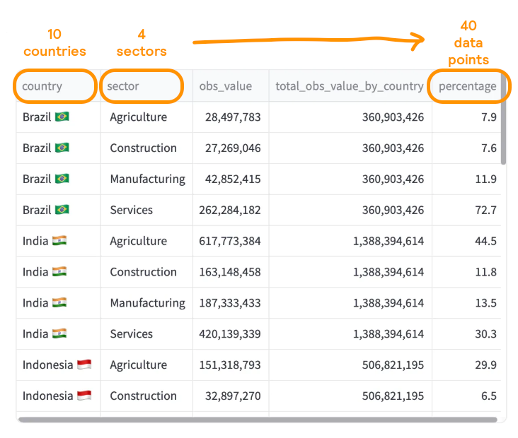
Image you are a consultant presenting at a conference about how workforce is distributed in each country. You collected the required data, which might look like the screenshot below.
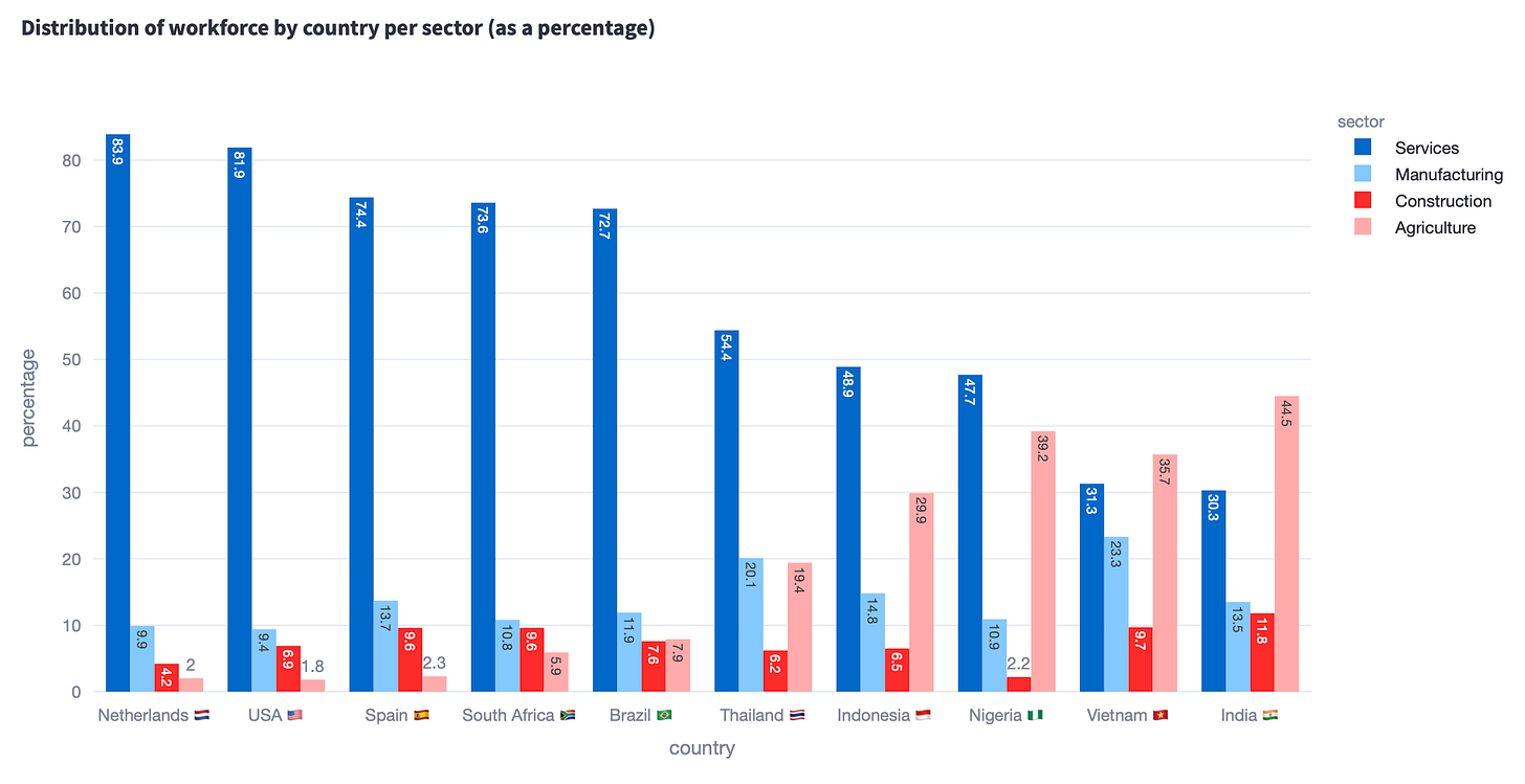
You want the chart to show what is the percentage of each sector by country. You don’t think too much about the chart design, and use the default output from plotly.express …
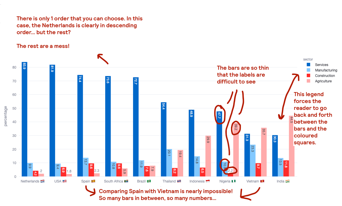
Where do I think this plot has issues?
The first thing to say is how poor both this chart is at telling an interesting story. Some clear issues are:
- You have to use a key, which slows down understanding. Back and forth we go, between bar and key
- You don’t too much space for data labels. I have tried adding them, but the bars are too narrow, and the labels are rotated. So either you are the exorcist child or you keep trying to decipher a value based on the y-axis or the provided gridlines.
- There are just too many bars, in no particular order. You can’t rank clustered bars in the same way as you can rank bars showing a single variable. Do you rank by the value of a specific “sector” category? Do you order alphabetically by the x-axis or the legend categories?
- Comparing the top of the bars is nearly impossible. Say that you want to compare if Vietnam has more workforce in construction that Spain… was it a fun exercise to look for the country, then figure out that construction is the red bar and somehow glance across the chart? Nope. I mean, if I hadn’t added the labels (even if rotated), you would have probably not been able to tell the difference.
Let’s see if there are better alternatives to the chart above.
Alternative # 1. Using subplots.
If the story you want to tell is one where the focus is on comparing which countries have the highest percentage per sector, then I would recommend separating categories into subplots. In, Awesome Plotly with code series (Part 8): How to balance dominant bar chart categories, we already introduced the use of subplots. The scenario was completely different, but it still showed how effective subplots can be.
Tweaking the chart above, could render the following.

Why do I think this plot is better than the clustered bar chart?
- The horizontal bar charts now allow for a more legible rendering of the data labels.
- There is no need of colour coding. Thanks to the subplot titles, one can easily understand which category is being displayed.
A word of caution
- Separating by subplots means that you have to select how to order the countries in the y-axis. This is done by choosing a specific category. In this case, I chose “agriculture”, which means that the other 3 categories to do not conserve their natural order, making comparisons difficult.
- The magnitude of the bars may (or may not) be kept across all subplots. In this case, we didn’t normalise the magnitudes. What I mean is that the range of values – from min to max – is determined for each individual subplot. The consequence is that you have bars of value 12 (see “construction” for India) rendered much larger than a bar of value 30 (see “services” for India).
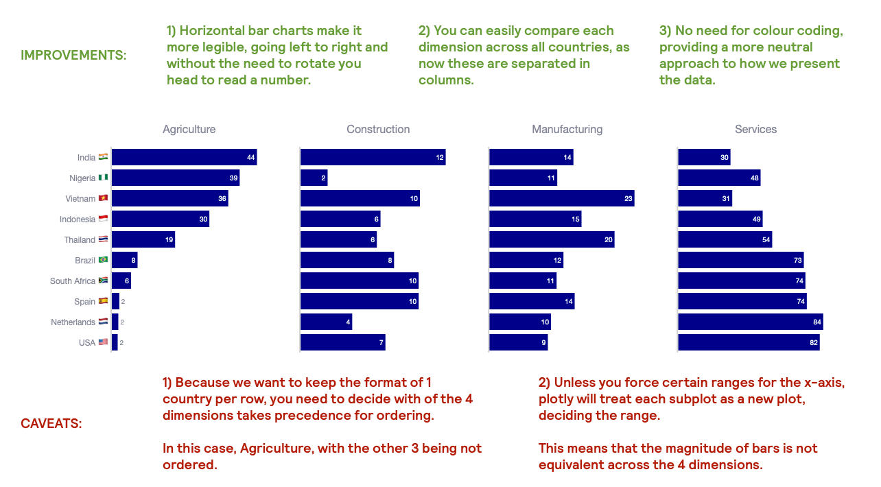
Nevertheless, even with it’s flaws, the subplot chart is way more legible than the first clustered bar chart.
Alternative #2. Using a stacked bar chart.
Now, say that what you want to convey is how skewed (or not) the distribution of the workforce by country is. As we saw in the subplot alternative, this is a bit difficult, as each bar chart is rendered differently by each subplot. The subplot alternative was great to answer that “India has the largest % of their workforce dedicated to construction, with Nigeria having the smallest”, but it is much more difficult to answer that “construction and services represent 77% of India’s workforce”.
Check the stacked bar below and decide which one do you prefer.
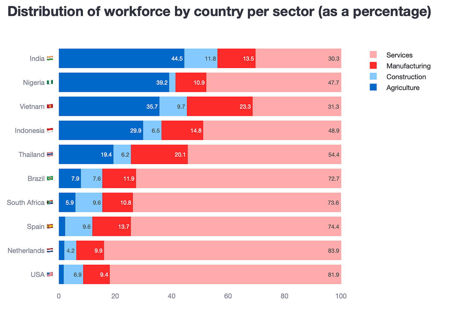
Why do I think this plot is better than the clustered bar chart?
- Stacked bar charts help pin a story for each of the rows in the y-axis. Now, even what was relatively easy to understand in the clustered bar chart, makes it much more easy to understand in the stacked one.
- The horizontal bar charts now allow for a more legible rendering of the data labels.
- Because you are dealing with percentages, stacked bar charts can really convey that numbers add up to 100%.
- Finally, all bars have the correct magnitudes.
A word of caution
- Similarly to the subplot alternative, separating by subplots means that you have to select how to order the countries in the y-axis.
- A colour coded legend is required, so some extra processing time is needed.
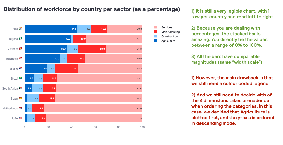
Again, despite it’s issues, I hope you would agree with me that the stacked bar chart is way more legible than the first clustered bar chart.
Tips on how to create these 2 plots
Creating a subplot chart
- 1st, you will of course need to create a subplot object
fig = make_subplots(
  rows=1, cols=4,
  shared_yaxes=True,
  subplot_titles=list_of_categories,
)- 2nd, simply loop through each category and plot each bar chart on the specific “column trace”
fig.add_trace(
    go.Bar(
        y=aux_df['country'],
        x=aux_df['percentage'],
        marker=dict(color='darkblue'),
        text=aux_df['percentage'].round(0),
        textposition='auto',
        orientation='h',
        showlegend=False,
    ),
    row=1, col=i
)
Creating a stacked bar chart
- 1st, decide the order of the main category
df = df.sort_values(['sector', 'percentage'], ascending=[True, True])- 2nd, loop through each category. Extract the information by country and add a trace.
for sector in df['sector'].unique():
  aux_df = df[df['sector'] == sector].copy()

  fig.add_trace(
            go.Bar(
                x=aux_df['percentage'],
                y=aux_df['country'],
                orientation='h',
                name=sector,
                text=aux_df['percentage'],
                textposition='auto',
            )
)- 3rd, you need to tell plotly that this is a stacked bar chart. You can do this in the
update_layoutmethod.
fig.update_layout(barmode='stack')As Shakespeare would have said had he worked as a data analyst: to subplot or to stack?
Scenario 2: How on earth to plot 5 countries against 7 types of food?
In this second scenario, you are working with multi-category data that represents how much type of food is exported by each country as a percentage of its total production. In the dataset below, you will have information about 5 countries and 7 types of food. How would you convey this information?
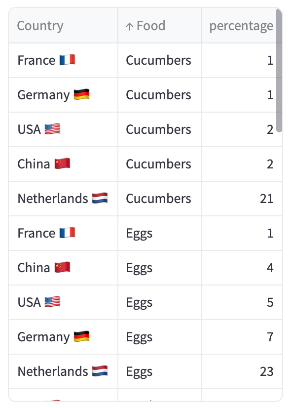
The default output which is doomed to fail
You try out what would the default output from plotly.express show. And what you see is not something you like.
Option 1. Put the countries in the x-axis with the food categories in the legend
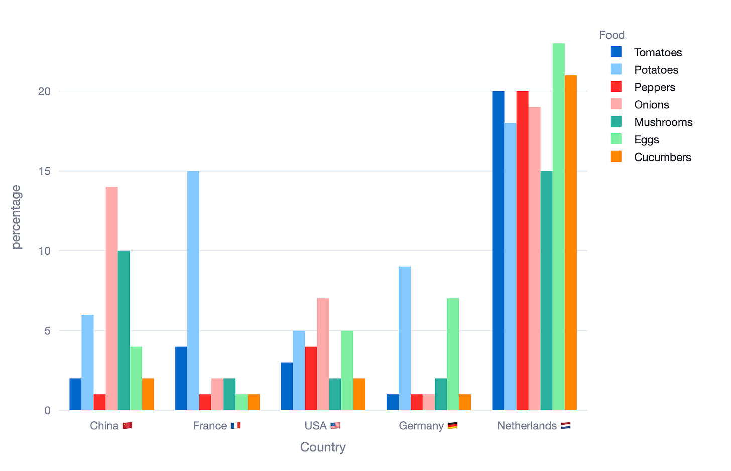
Option 2. Put the food categories in the x-axis and countries in the legend
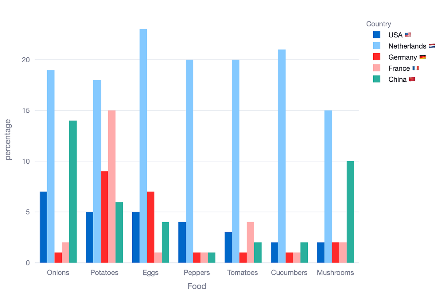
You will convene with me that neither chart can be used to tell a clear story. Let’s see what happens if we use a stacked bar chart as above.
Alternative # 1. The stacked bar chart (which in this case, fails)
The stacked bar chart served us well in the previous scenario. Can it also help us here, where we have more categories and where the sum of the percentages is not equal to 100%?
Check the bar charts below:
Option 1. Put the countries in the x-axis with the food categories in the legend
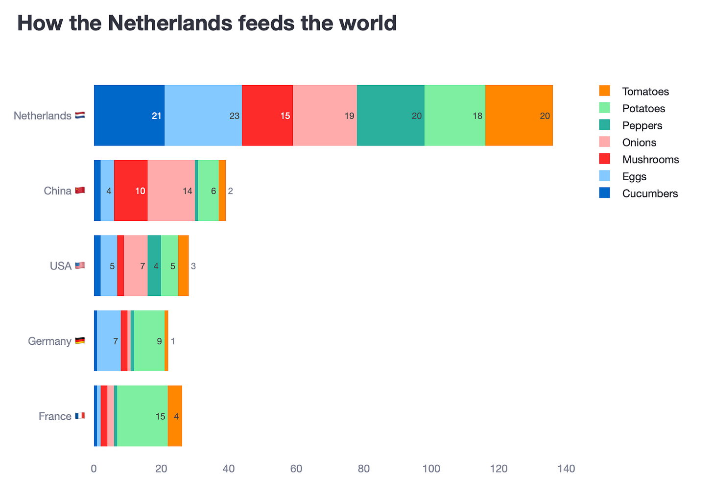
Option 2. Put the food categories in the x-axis and countries in the legend
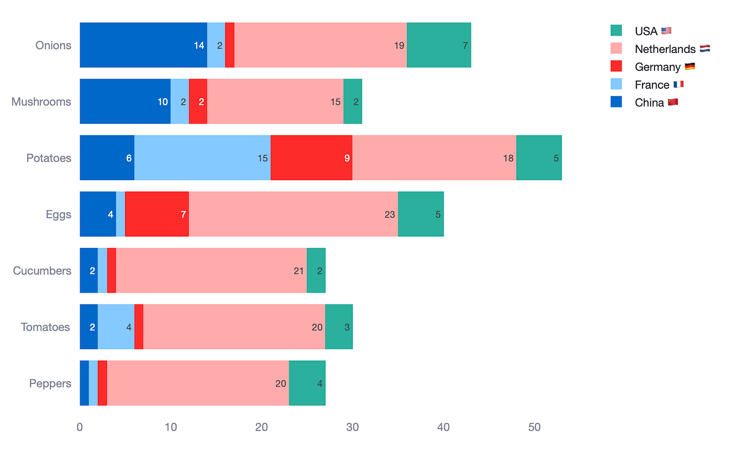
Both stacked charts really fail to simplify what we are looking it. In fact, I would argue they are as difficult to read as the clustered bar chart. So, in this case, stacked bar charts have actually failed us.
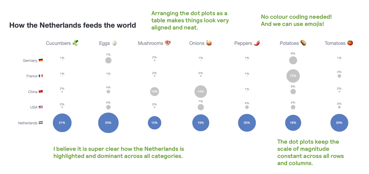
Alternative #2. The dot plot (which is a fancy scatter plot)
This alternative I am about to present is inspired in the subplot idea we used in scenario 1. However, in this case, I will change the bars for dots.
One thing I didn’t like from scenario 1, was that the magnitude of bars didn’t make sense across the different categories. Each subplot had it’s own x-axis range.
Now, what do you think of this dot plot approach for clearer data storytelling?

Why do I think this plot is better?
- Dot plot magnitudes are kept constant across the board.
- Given that I have a country (Netherlands) which surpasses the rest, I feel the dots convey this superiority better – even more when I colour them differently.
- Having these subplots arranged as a table, makes thing look aligned and neat. In other words, it is easy to scan for answers at the country level or at the food category level.
- No colour coding required! And we can use emojis!
Tips on how to create this plot
- 1st, create a subplots object. I have defined the titles with emojis using a dictionary
list_of_categories = df['Food'].unique().tolist()
list_of_categories.sort()
food_to_emoji = {
'Cucumbers': ' ',
'Eggs': '
',
'Eggs': ' ',
'Mushrooms': '
',
'Mushrooms': ' ',
'Onions': '
',
'Onions': ' ',
'Peppers': '
',
'Peppers': ' ',
'Potatoes': '
',
'Potatoes': ' ',
'Tomatoes': '
',
'Tomatoes': ' '
}
subplot_titles = [f"{category} {food_to_emoji.get(category, '')}" for category in list_of_categories]
fig = make_subplots(rows=1, cols=7, shared_yaxes=True,
subplot_titles=subplot_titles
)
'
}
subplot_titles = [f"{category} {food_to_emoji.get(category, '')}" for category in list_of_categories]
fig = make_subplots(rows=1, cols=7, shared_yaxes=True,
subplot_titles=subplot_titles
)- 2nd, how to add 1 single data point for each combination of {country}-{food}? Loop through the food categories, but in the x-axis force plotting a dummy value (I used the number 1)
for i, feature in enumerate(list_of_categories):
  c = i + 1

  if c == 1:
        aux_df = df[df['Food'] == feature].sort_values('percentage', ascending=False).copy()
     else:
        aux_df = df[df['Food'] == feature].copy()
     fig.add_trace(
              go.Scatter(
                  y=aux_df['Country'],
                  x=[1] * len(aux_df), # <---- forced x-axis
                  mode='markers+text',
                  text=text,
                  textposition=textposition,
                  textfont=textfont,
                  marker=marker,
                  showlegend=False,
              ),
              row=1, col=c
)- 3rd, but if you plot the value 1, how do you show the real food % values? Easy, you define those in the
text,textposition,textfontandmarkerparameters.
text = [f"{val}%" for val in aux_df['percentage'].round(0)]

textposition = ['top center' if val < 10 else 'middle center' for val in aux_df['percentage']]
textfont = dict(color=['grey' if val < 10 else 'white' for val in aux_df['percentage']])
marker = dict(size=aux_df['percentage'] * 3,
              color=['rgb(0, 61, 165)' if country == 'Netherlands  ' else 'darkgrey' for country in aux_df['Country']])
Scenario 3: Clustered charts fail to convey change over 2 groups.
In both scenarios above, we were dealing with multiple categories and saw how clustered bar charts hinder our ability to quickly understand the message we are trying to convey. In this last scenario, we cover the case where you only have 2 categories. In this case, 2 different periods in time (it could be 2 segments, 2 areas, etc)
Because the cardinality is so small (only 2), I have seen many people still using stacked bar charts. Check the data below. It represents the ranking that different Spanish football teams have held in 2 different seasons.
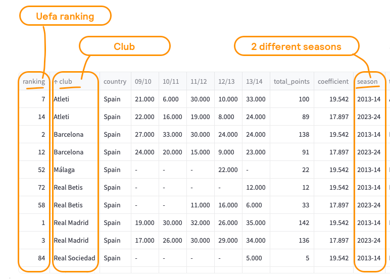
If you plotted the teams in the x-axis, the ranking in the y-axis and the season as a coloured legend, we would have the following plot.

Where do I think this plot has issues?
- Rankings are not well represented with bar charts. For example, here a larger ranking is worse (ie, rank = 1 is much better than rank = 50)
- It is not easy to compare rankings for the season 2023–2024. This is because we have sorted the chart in ascending order based on the 2013–2014 season.
- There are teams which had a UEFA ranking in season 2013–2014, but didn’t in 2023–2024 (Malaga). This is not immediately apparent from the chart.

The slope graph alternative
I always move to slope graphs when I need to visualise rank comparison or any story of change (ie, this datapoint has travelled from here to here). Change doesn’t have to be over time (although it is the most common type of change). A slope graph could be used to compare 2 scenarios, 2 opposite views, 2 geographies, etc. I really like them because your eye can easily travel from start point to end point without interruption. In addition, it makes the degree of change way more obvious. Check the chart below… is the story of how Valencia CF completely destroyed it’s ranking since the arrival of a new owner.

Tips on how to create this plot
- 1st, loop through each club and plot a Scatter plot.
for club in df['club'].unique():
  club_data = df[df['club'] == club]

  # DEFINITION OF COLOUR PARAMETERS
  ...
  fig.add_trace(go.Scatter(
    x=club_data['season'],
    y=club_data['ranking'],
    mode='lines+markers+text',
    name=club,
    text=club_data['text_column'],
    textposition=['middle left' if season == '2013-14' else 'middle right' for season in club_data['season']],
    textfont=dict(color=colour_),
    marker=dict(color=color, size=marker_size),
  line=dict(color=color, width=line_width)
))- 2nd, define the
text,textfont,markerandlineparameters.
for club in df['club'].unique():
  club_data = df[df['club'] == club]

  if club == 'Valencia':
         color = 'orange'
         line_width = 4
         marker_size = 8
         colour_ = color
      else:
         color = 'lightgrey'
         line_width = 2
         marker_size = 6
         colour_ = 'grey'

      # go.Scatter()
...- 3rd, because we are dealing with “rankings”, you can set the
yaxis_autorange='reversed'
fig.update_layout(
   ...
   yaxis_autorange='reversed',  # Rankings are usually better when lower
)
Summary of multi-category visualization approaches
In this post, we explored how to move beyond clustered bar charts by using more effective visualisation techniques. Here’s a quick recap of the key takeaways:
Scenario 1: subplots vs. stacked bars
- Subplots: Best for category-specific comparisons, with clear labels and no need for colour-coded legends.
- Stacked Bars: Ideal for showing cumulative distributions, with consistent bar magnitudes and intuitive 100% totals.
Scenario 2: dot plot for high cardinality
- When dealing with multiple categories both in the x and y axis, dot plots offer a cleaner view.
- Unlike subplots or stacked bars, dot plots keep magnitudes constant and comparisons clear.
Scenario 3: slope graphs for two-point comparisons
- For tracking changes between two points, slope graphs clearly show movement and direction.
- They highlight upward, downward, or stable trends in a single glance.
Where can you find the code?
In my repo and the live Streamlit app:
Acknowledgements
- Source: ILOSTAT
- Source: Uefa rankings
Further reading
Thanks for reading the article! If you are interested in more of my written content, here is an article capturing all of my other blogs posts organised by themes: Data Science team and project management, Data storytelling, Marketing & bidding science and Machine Learning & modelling.
Stay tuned!
If you want to get notified when I release new written content, feel free to follow me on Medium or subscribe to my Substack newsletter. In addition, I would be very happy to chat on Linkedin!
Originally published at https://joseparreogarcia.substack.com.
The post Awesome Plotly with code series (Part 9): To dot, to slope or to stack? appeared first on Towards Data Science.
Simple methods to replace cluttered bar charts with crisp, reader-friendly visuals.
The post Awesome Plotly with code series (Part 9): To dot, to slope or to stack? appeared first on Towards Data Science. Data Science, Data Visualization, Data Storytelling, Plotly, Python Towards Data ScienceRead More

 Add to favorites


0 Comments