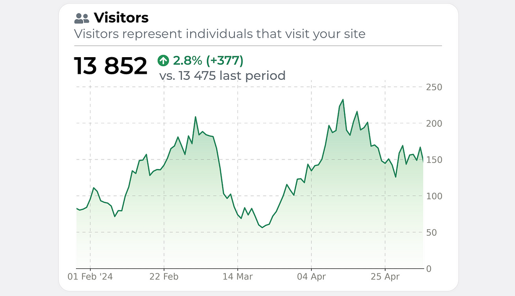
Transform boring default Matplotlib line charts into stunning, customized visualizations
Everyone who has used Matplotlib knows how ugly the default charts look like. In this series of posts, I’ll share some tricks to make your visualizations stand out and reflect your individual style.
We’ll start with a simple line chart, which is widely used. The main highlight will be adding a gradient fill below the plot — a task that’s not entirely straightforward.
So, let’s dive in and walk through all the key steps of this transformation!
Let’s make all the necessary imports first.
import pandas as pd
import numpy as np
import matplotlib.dates as mdates
import matplotlib.pyplot as plt
import matplotlib.ticker as ticker
from matplotlib import rcParams
from matplotlib.path import Path
from matplotlib.patches import PathPatch

np.random.seed(38)
Now we need to generate sample data for our visualization. We will create something similar to what stock prices look like.
dates = pd.date_range(start='2024-02-01', periods=100, freq='D')
initial_rate = 75
drift = 0.003
volatility = 0.1
returns = np.random.normal(drift, volatility, len(dates))
rates = initial_rate * np.cumprod(1 + returns)

x, y = dates, rates
Let’s check how it looks with the default Matplotlib settings.
fix, ax = plt.subplots(figsize=(8, 4))
ax.plot(dates, rates)
ax.xaxis.set_major_locator(mdates.DayLocator(interval=30))
plt.show()
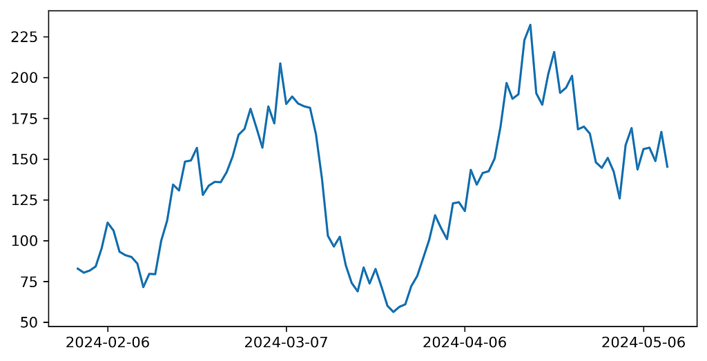
Not really fascination, right? But we will gradually make it looking better.
- set the title
- set general chart parameters — size and font
- placing the Y ticks to the right
- changing the main line color, style and width
# General parameters
fig, ax = plt.subplots(figsize=(10, 6))
plt.title("Daily visitors", fontsize=18, color="black")
rcParams['font.family'] = 'DejaVu Sans'
rcParams['font.size'] = 14

# Axis Y to the right
ax.yaxis.tick_right()
ax.yaxis.set_label_position("right")

# Plotting main line
ax.plot(dates, rates, color='#268358', linewidth=2)

Alright, now it looks a bit cleaner.
Now we’d like to add minimalistic grid to the background, remove borders for a cleaner look and remove ticks from the Y axis.
# Grid
ax.grid(color="gray", linestyle=(0, (10, 10)), linewidth=0.5, alpha=0.6)
ax.tick_params(axis="x", colors="black")
ax.tick_params(axis="y", left=False, labelleft=False)

# Borders
ax.spines["top"].set_visible(False)
ax.spines['right'].set_visible(False)
ax.spines["bottom"].set_color("black")
ax.spines['left'].set_color('white')
ax.spines['left'].set_linewidth(1)

# Remove ticks from axis Y
ax.tick_params(axis='y', length=0)
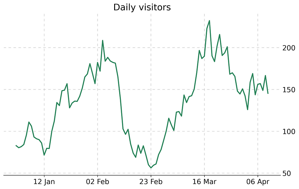
Now we’re adding a tine esthetic detail — year near the first tick on the axis X. Also we make the font color of tick labels more pale.
# Add year to the first date on the axis
def custom_date_formatter(t, pos, dates, x_interval):
    date = dates[pos*x_interval]
    if pos == 0:
        return date.strftime('%d %b '%y')
    else:
        return date.strftime('%d %b')
ax.xaxis.set_major_formatter(ticker.FuncFormatter((lambda x, pos: custom_date_formatter(x, pos, dates=dates, x_interval=x_interval))))

# Ticks label color
[t.set_color('#808079') for t in ax.yaxis.get_ticklabels()]
[t.set_color('#808079') for t in ax.xaxis.get_ticklabels()]

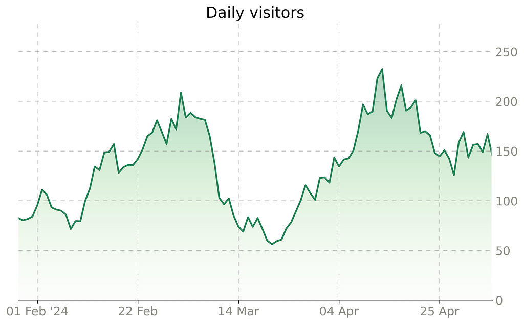
And we’re getting closer to the trickiest moment — how to create a gradient under the curve. Actually there is no such option in Matplotlib, but we can simulate it creating a gradient image and then clipping it with the chart.
# Gradient
numeric_x = np.array([i for i in range(len(x))])
numeric_x_patch = np.append(numeric_x, max(numeric_x))
numeric_x_patch = np.append(numeric_x_patch[0], numeric_x_patch)
y_patch = np.append(y, 0)
y_patch = np.append(0, y_patch)

path = Path(np.array([numeric_x_patch, y_patch]).transpose())
patch = PathPatch(path, facecolor='none')
plt.gca().add_patch(patch)

ax.imshow(numeric_x.reshape(len(numeric_x), 1),  interpolation="bicubic",
                cmap=plt.cm.Greens,
                origin='lower',
                alpha=0.3,
                extent=[min(numeric_x), max(numeric_x), min(y_patch), max(y_patch) * 1.2],
                aspect="auto", clip_path=patch, clip_on=True)
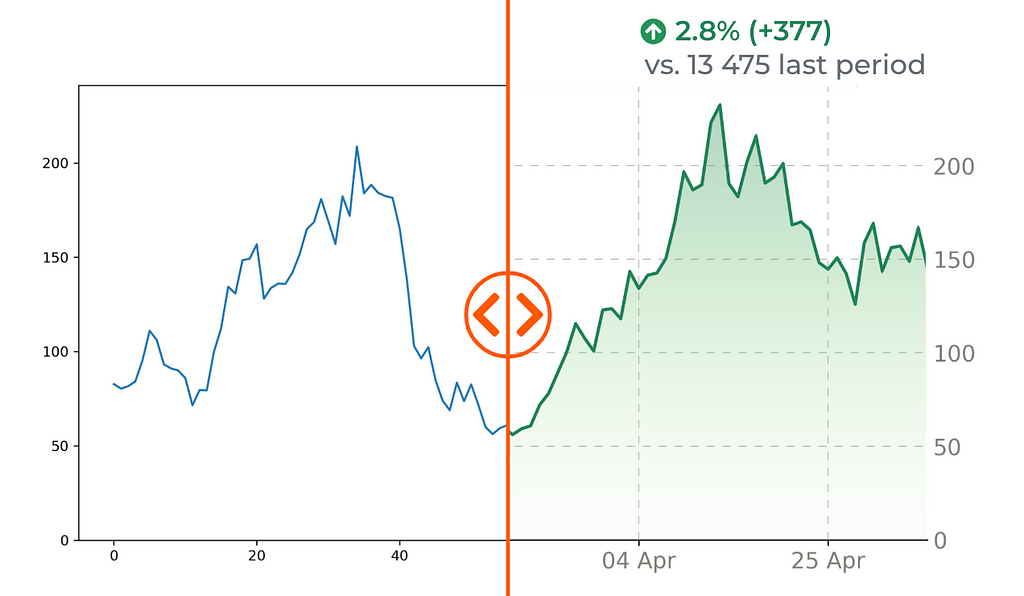
Now it looks clean and nice. We just need to add several details using any editor (I prefer Google Slides) — title, round border corners and some numeric indicators.
The full code to reproduce the visualization is below:
https://medium.com/media/6986ff9cd74116aad0f10458818cfd42/href
From Default Python Line Chart to Journal-Quality Infographics was originally published in Towards Data Science on Medium, where people are continuing the conversation by highlighting and responding to this story.
Transform boring default Matplotlib line charts into stunning, customized visualizationsCover, image by the AuthorEveryone who has used Matplotlib knows how ugly the default charts look like. In this series of posts, I’ll share some tricks to make your visualizations stand out and reflect your individual style.We’ll start with a simple line chart, which is widely used. The main highlight will be adding a gradient fill below the plot — a task that’s not entirely straightforward.So, let’s dive in and walk through all the key steps of this transformation!Let’s make all the necessary imports first.import pandas as pdimport numpy as npimport matplotlib.dates as mdatesimport matplotlib.pyplot as pltimport matplotlib.ticker as tickerfrom matplotlib import rcParamsfrom matplotlib.path import Pathfrom matplotlib.patches import PathPatchnp.random.seed(38)Now we need to generate sample data for our visualization. We will create something similar to what stock prices look like.dates = pd.date_range(start=’2024-02-01′, periods=100, freq=’D’)initial_rate = 75drift = 0.003volatility = 0.1returns = np.random.normal(drift, volatility, len(dates))rates = initial_rate * np.cumprod(1 + returns)x, y = dates, ratesLet’s check how it looks with the default Matplotlib settings.fix, ax = plt.subplots(figsize=(8, 4))ax.plot(dates, rates)ax.xaxis.set_major_locator(mdates.DayLocator(interval=30))plt.show()Default plot, image by AuthorNot really fascination, right? But we will gradually make it looking better.set the titleset general chart parameters — size and fontplacing the Y ticks to the rightchanging the main line color, style and width# General parametersfig, ax = plt.subplots(figsize=(10, 6))plt.title(“Daily visitors”, fontsize=18, color=”black”)rcParams[‘font.family’] = ‘DejaVu Sans’rcParams[‘font.size’] = 14# Axis Y to the rightax.yaxis.tick_right()ax.yaxis.set_label_position(“right”)# Plotting main lineax.plot(dates, rates, color=’#268358′, linewidth=2)General params applied, image by AuthorAlright, now it looks a bit cleaner.Now we’d like to add minimalistic grid to the background, remove borders for a cleaner look and remove ticks from the Y axis.# Gridax.grid(color=”gray”, linestyle=(0, (10, 10)), linewidth=0.5, alpha=0.6)ax.tick_params(axis=”x”, colors=”black”)ax.tick_params(axis=”y”, left=False, labelleft=False) # Bordersax.spines[“top”].set_visible(False)ax.spines[‘right’].set_visible(False)ax.spines[“bottom”].set_color(“black”)ax.spines[‘left’].set_color(‘white’)ax.spines[‘left’].set_linewidth(1)# Remove ticks from axis Yax.tick_params(axis=’y’, length=0)Grid added, image by AuthorNow we’re adding a tine esthetic detail — year near the first tick on the axis X. Also we make the font color of tick labels more pale.# Add year to the first date on the axisdef custom_date_formatter(t, pos, dates, x_interval): date = dates[pos*x_interval] if pos == 0: return date.strftime(‘%d %b ‘%y’) else: return date.strftime(‘%d %b’) ax.xaxis.set_major_formatter(ticker.FuncFormatter((lambda x, pos: custom_date_formatter(x, pos, dates=dates, x_interval=x_interval))))# Ticks label color[t.set_color(‘#808079’) for t in ax.yaxis.get_ticklabels()][t.set_color(‘#808079′) for t in ax.xaxis.get_ticklabels()]Year near first date, image by AuthorAnd we’re getting closer to the trickiest moment — how to create a gradient under the curve. Actually there is no such option in Matplotlib, but we can simulate it creating a gradient image and then clipping it with the chart.# Gradientnumeric_x = np.array([i for i in range(len(x))])numeric_x_patch = np.append(numeric_x, max(numeric_x))numeric_x_patch = np.append(numeric_x_patch[0], numeric_x_patch)y_patch = np.append(y, 0)y_patch = np.append(0, y_patch)path = Path(np.array([numeric_x_patch, y_patch]).transpose())patch = PathPatch(path, facecolor=’none’)plt.gca().add_patch(patch)ax.imshow(numeric_x.reshape(len(numeric_x), 1), interpolation=”bicubic”, cmap=plt.cm.Greens, origin=’lower’, alpha=0.3, extent=[min(numeric_x), max(numeric_x), min(y_patch), max(y_patch) * 1.2], aspect=”auto”, clip_path=patch, clip_on=True)Gradient added, image by AuthorNow it looks clean and nice. We just need to add several details using any editor (I prefer Google Slides) — title, round border corners and some numeric indicators.Final visualization, image by AuthorThe full code to reproduce the visualization is below:https://medium.com/media/6986ff9cd74116aad0f10458818cfd42/hrefFrom Default Python Line Chart to Journal-Quality Infographics was originally published in Towards Data Science on Medium, where people are continuing the conversation by highlighting and responding to this story. charts, visualization, matplotlib, analytics, infographics Towards Data Science – MediumRead More

 Add to favorites

0 Comments